
How AI Analytics can improve your marketing in at least nine ways
Which parts of my campaigns are performing well? Is a CTR of 17.5% good? What does an acceptance rate of 99.5% mean? What about CLV, AOV, bounces, clicks on landing pages, etc.?
Marketers love tables, bar charts, and line graphs. Almost all marketing software includes these types of overviews. And if you let AI analyse your data, you can gain a lot of insights from all that data and answer the questions above. AI Analytics helps you bridge the gap between data and insight. And that can yield a lot.
What are AI-driven marketing reports?
As soon as you use AI to automatically collect, analyse, and interpret marketing data, you have AI-driven marketing reporting.
You can often set up such reports manually, but their power lies in their automatic generation. After all, you want AI to take the work off your hands so you don’t have to keep typing in all kinds of queries.
In this guide, we answer the following four questions:
- How can you use AI to improve your marketing reports?
- What prompts should you use for AI Analytics?
- How can you increase your marketing effectiveness with AI Analytics?
- How can you use AI Analytics to improve your results?
How does Spotler help?
Once you discover the magic of AI Analytics, you’ll want to keep experimenting. Especially in Spotler. We’ve built a visually powerful search-based interface for you with a nearly complete list of marketing keywords and metrics, including predefined formulas and parameters.
Get answers to all your data questions
With our AI Analytics software, you can automatically generate beautiful graphs for all your data questions. You don’t need any SQL knowledge, you don’t have to fiddle around like in Power BI, you simply select the right data points using handy pull-down menus. It’s a data feast!
Discover the magic of Spotler AI and increase your marketing insight! Request a demo
This guide is designed to be practical. All the information is accompanied by useful use cases. In other words, you get examples of how AI can help you gain knowledge and insights from your data. Knowledge and insights that marketers want, but which are often difficult to extract from traditional and static statistics.
The added value of AI for your marketing reports
If you ask ChatGPT about the added value of AI, you will get the following answer:
“Automating routine tasks, personalising experiences, and providing insights or recommendations that help people make better choices with less effort.”
The added value of AI for your marketing reports fits this definition. Try it: what choices would you make if you saw the mailing statistics below?
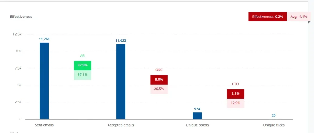
This statistic gives you a dynamic overview of the delivery, opens, and clicks of a sent mailing in Mail+ for 30 days. Compared to a previous mailing, both opens and clicks lagged behind somewhat. If you want to draw conclusions from this, you will have to investigate. For example:
- Can I create a more detailed trend report to see to what extent this mailing really differs from my regular campaigns?
- Have I perhaps approached a different target group that behaves differently from previous mailings?
- Does a lower click-through rate also affect the number of conversions, or is there no correlation?
- Is a lower click-through rate related to the number and type of links I included in the mailing?
- Would it be wise to set up an A/B test on my most important buttons to improve the click-through rate, or is that not where the problem lies?
In our experience, many marketers ask these questions, but researching them often takes too much time or is too complicated. This is especially true when it comes to campaigns that consist of multiple touchpoints and multiple channels.
An example of the added value of AI Analytics
Suppose you work in eCommerce and want to know what happens after a click. Your bottom-line goal is conversion, and you are more interested in something like the “purchase-to-click ratio” than just a CTO of 18.4%.
Or, in other words, you are more interested in which campaigns have a high click-through rate but convert poorly. The reason for this knowledge is to gain insight into the effect of landing pages and more control over the checkout process. Why do clickers drop out? And you want this knowledge in real time on your screen for every campaign.
With AI Analytics, this can be set up. Curious about how to do this? We’ll explain it, but if you can’t wait, read more here.
How can you improve your marketing reports with AI?
In the following ways:
- Automatic data integration: AI links data from different channels (Google Ads, Meta, email marketing, SEO, etc.) and builds a single integrated overview.
- Real-time dashboards: Reports that continuously update themselves, allowing you to respond to trends more quickly.
- Anomaly detection: AI automatically flags anomalies in campaigns (e.g., sudden drops in CTR or conversions).
- Predictive analytics: Insights into future performance and insight into campaigns that are likely to yield the highest return.
- Attribution analysis: Smarter allocation of conversions to channels, based on customer behaviour rather than just last click.
- Natural Language Reporting: AI writes clear summaries of data, so you can understand what is happening more quickly.
Not all AI Analytics providers offer the same functionalities, but the above improvements give a good idea of the possibilities. As a marketer, you often have to set up the AI tool once to enable attribution analysis or anomaly detection, but good AI Analytics software helps you with this:
AI Analytics helps you interpret data
Because gaining insight from a single static data analysis is not easy and it takes a lot of research to compare different statistics, it is important that AI supports you in this. And it can.
AI Analytics works with an input field or search bar similar to those found on Google and ChatGPT:

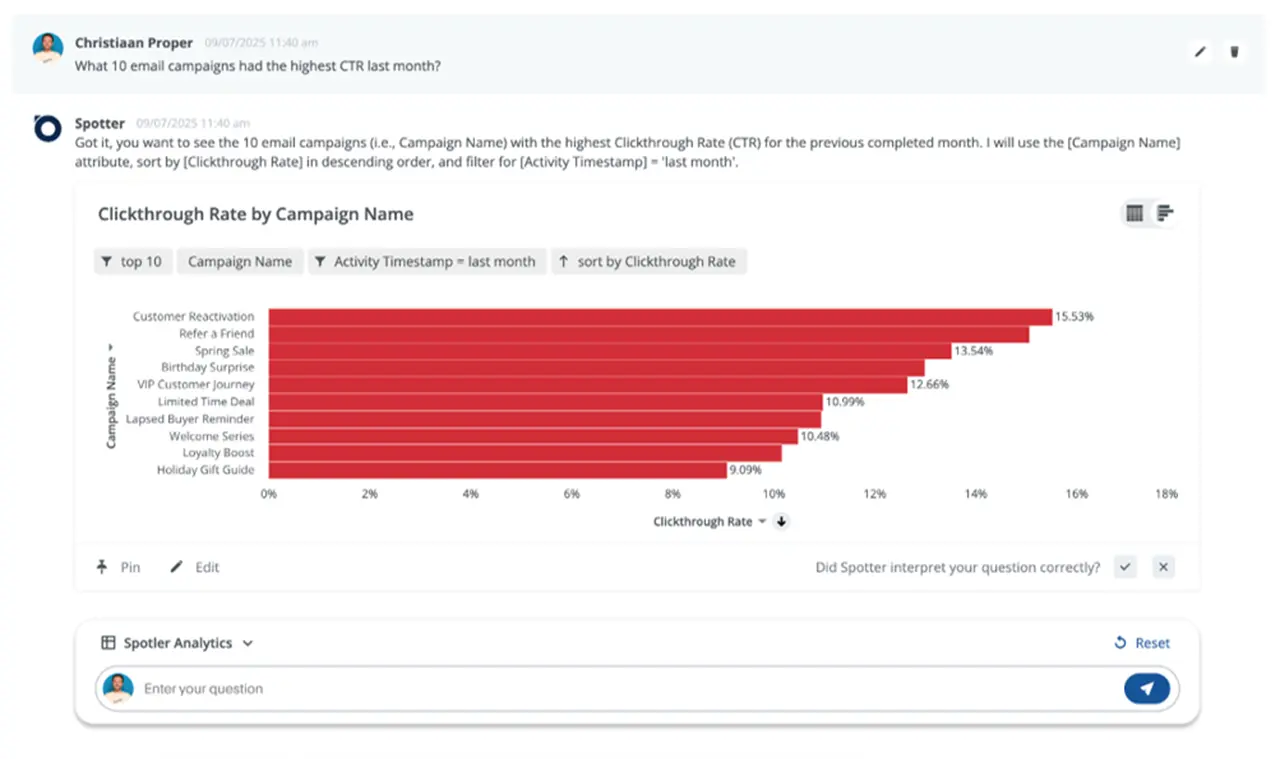
As a marketer, you might type the following into your AI Analytics software:
“Which 10 email campaigns had the highest CTR last month?”
If you use Spotler’s software for AI Analytics, you will receive the following reassuring response:
“Got it. You want to see the 10 email campaigns (i.e. Campaign Name) with the highest Clickthrough Rate (CTR) for the month that was completed the previous month. I will use the [Campaign Name] attribute, sort by [Clickthrough Rate] in descending order, and filter for [Activity Timestamp] = ‘last month’.”
AI Analytics lets you have a dialogue with your data
The AI delivers the data column names, the values entered, and all kinds of keywords such as “last month” or “contains” on which the output of your question is based. You then get the graph you want. If you now want to know the conversion rate of these campaigns and which campaigns score low in this respect, you can enter that as a follow-up question.
In this way, you engage in a dialogue with your data and leave all the complicated research to your AI tool. Even better: once you are satisfied with your search result, you can save the search query and pin it to a live board or live dashboard. Every time you log in, you get real-time insight into these statistics.
This way, you can use AI to improve your marketing reports.
Which prompts should you use for AI Analytics?
In AI Analytics, a distinction is made between SQL and NLQ. SQL stands for Structured Query Language and NLQ for Natural Language Query.
SQL is a standardized language that you can use to query and modify data in relational databases. If you were to express the above question (What 10 email campaigns had the highest CTR last month?) in SQL, you would get the following in MySQL 8+ (an SQL dialect):
SELECT
  campaign_id,
  campaign_name,
  ROUND(100 * SUM(clicks) / NULLIF(SUM(delivered), 0), 2) AS ctr_percent
FROM email_campaigns
WHERE send_date >= DATE_FORMAT(CURDATE() - INTERVAL 1 MONTH, '%Y-%m-01')
  AND send_date < DATE_FORMAT(CURDATE(), '%Y-%m-01')
GROUP BY campaign_id, campaign_name
ORDER BY ctr_percent DESC
LIMIT 10;
This SQL translation does contain some assumptions about table and column names, but regardless of that, this is not what you want as a marketer. You don’t want to have to take an SQL training course before you can use AI Analytics. That’s why you can ‘simply’ type your question into the database, just as you would ask a colleague. Fortunately, AI Analytics uses NLQ.
But even in ‘normal’ language, not every input is equally effective. To help you with this, we provide a large number of use cases with prompt examples in NLQ to improve your marketing.
How can you increase your marketing effectiveness with AI Analytics?
We have developed and tested the following seven interesting use cases for you. You can achieve the following if you set up AI Analytics correctly:
- Quickly put an end to inefficient campaigns
- Ensure good list hygiene that protects delivery
- Get a handle on campaigns that lead to a lot of unsubscribes
- Don’t send at inefficient times
- Get a handle on high-discount campaigns that underperform
- Get a handle on campaign steps that result in a decline in engagement
- Identify excessive personalisation without return
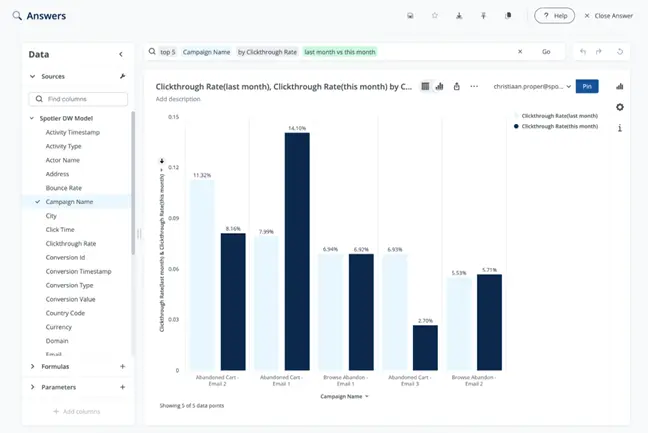
Quickly put an end to inefficient campaigns
If you run a lot of campaigns, you want quick insight into the campaigns that are underperforming. With that insight, you can adjust such a campaign or decide to stop investing in it.
What do you need?
You need to analyse the difference between high and low scores along two axes: purchases and revenue per send. And if you want a quick insight into the extremes of both scores, you can create a bar chart with grouped columns. Here is an entirely random example based on the axes months and revenue:
The advantage of such a graph is the quick insight it provides: you can immediately see which months score well and which score poorly.
If you work with Spotler, our AI Analytics software provides you with a handy graph for comparing the data you want to analyse. The NLQ prompt you need to enter is: provide an overview of all campaigns from the past 30 days, including their revenue. Next, perform a change analysis on the two axes mentioned to create a bar chart similar to this. In good AI Analytics software, performing a change analysis is not very complicated.
Comparing the extremes provides a wealth of insight. There is a good chance that you will also discover trends in your metrics that you would not have noticed without such an analysis.
Ensure good list hygiene to protect delivery
Every marketer wants to prevent bounces. Marketing communications that are not delivered damage your reputation. You are now used to following up on bounces as soon as they come in. Of course, you should continue to do so, but how nice would it be if you could get a better handle on this?
Enter the following NLQ prompt: provide an overview of the daily bounce rate for the past 30 days. Once you have this information, you will want to know why there are peaks on certain days. You want to know the underlying causes and, ideally, set up an alert as soon as such a peak in your bounce rate occurs.
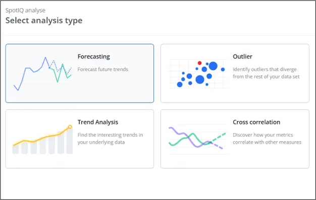
If your AI Analytics software is equipped with a module for forecasting, trends, and outliers, you will gain insight into these causes. And with that knowledge, you can work proactively to protect your reputation.
Get a handle on campaigns that lead to a lot of unsubscribes
What applies to your bounce rate also applies to your unsubscribes. How great would it be if you had a better understanding of which campaigns lead to high unsubscribe rates and what causes them? You enter the same prompt as for the bounce rate, but now you type in the term “unsubscribe rate” and use the outlier analysis option again.
Don’t send at inefficient times
You can greatly increase the effectiveness of your marketing by sending your communications at times when your readers, customers, or prospects are waiting for them. Every marketer would rather send a communication on Tuesday if that leads to better results than on other days of the week. Even if Thursday is the regular sending day.
But how do you know exactly when that is? Or even more specifically: how do you extract that information from your campaign statistics?
Enter the following NLQ prompt: show me the open rate per day of the week for the past 90 days. Once you have this information, you will want to know if there is a trend in this data. Use the Trend Analysis feature in your AI software to gain insight into this.
Get a handle on high-discount campaigns that are underperforming
For your margins, it is important that high-discount campaigns perform well. In fact, they should perform much better than campaigns without discounts. In other words, if your high-discount campaigns are performing poorly, then the target group you have targeted is not sufficiently sensitive to them. In that case, it is a good idea to use other means of persuasion.
Enter the following NLQ prompt: show me the revenue of each message sent, specified per campaign, for the past 30 days. It is also useful if your campaigns are tagged with “discount” and “no discount.”
Get a handle on campaign steps that result in a decline in engagement
You can also search specifically for campaign steps that have led to a decline in engagement. Who knows, your entire campaign may perform better if you address the poorly performing parts. With AI Analytics, you can perform such an analysis if you have the option to select ‘purchases per step’.
Identify excessive personalisation without return
Another major advantage of AI Analytics is the ability to spot interesting correlations in your data. Not all AI Analytics software offers this option, but it is interesting if you can filter on the extent to which you have applied different personalisation techniques, for example.
For example, you could investigate whether the use of personalisation techniques has an impact on your sales. After all, the general wisdom is that personalisation is good for your revenue. With AI Analytics, you can find out whether or not this rule applies to your own database and to what extent.
How can you improve your results with AI Analytics?
AI Analytics not only gives you more insight into the effectiveness of all your marketing efforts; this software also helps you earn more money. Or, in other words, improve your results. Finally – in this already extensive guide – we give you two more use cases that will help you achieve this:
- Identify campaigns with high clicks and low conversion
- Identify the campaign components that lead to the best results
Identify campaigns with high clicks and low conversion
High clicks suggest an appealing message. Appealing marketing messages should lead to conversion. If that’s not the case, it’s good to get a handle on this. Apparently, something is going on “after the click.”
Simply order a product yourself from the marketing message with high clicks and low conversion to find out what is wrong. This will make your statistics less abstract, improve your marketing processes, and lead to better results.
The prompt you use is not complicated: give me an overview of the Purchase-to-Click Rate and the Click-Through Rate for each campaign message. You can then compare the two.
Identify the campaign components that lead to the best results
Every campaign has a specific timing or lead time, is made up of different communications (email, app messages, social posts, webpages, etc.), and is designed for a specific audience. If a campaign delivers the desired results, it is interesting to know which campaign components were responsible for this.
With AI Analytics, you can perform an attribution analysis. The prompt: Provide an overview of all campaigns from the past 30 days, including their revenue. Use the Correlation feature in your AI software to cross-check the various campaign components.
Insight into attribution is invaluable. It is knowledge that you can immediately apply to all subsequent campaigns and that will significantly improve the results of your campaigns.
The data insight provided by AI Analytics is exceptional
When you put AI to work with your marketing metrics, you can identify interesting correlations, trends, and outliers, and make predictions. This guide has provided you with nine examples that you can set up and configure yourself. This can often be done surprisingly quickly when you use the right software for AI Analytics.
Want to get started with AI analytics yourself?
AI not only saves you time. By using AI Analytics, you also gain insight into the impact and returns of your marketing, which often remain invisible with static, non-AI-driven data. You simply learn a lot from your own data. Want to know how? Schedule a demo with our consultants.