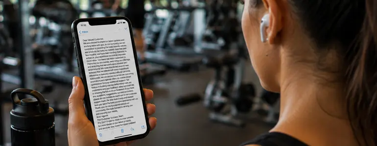
Mobile is not a smaller desktop: How to design better emails for mobile
Andy GilhooleyPublished on: 21 August 2026
A responsive email isn’t necessarily a mobile-friendly email. Learn how to design for the way people read, scroll and interact with emails on their phones, from the first screen to the final tap.
There’s a version of me that email marketers really don’t want on their mailing list at 7:30 in the morning.
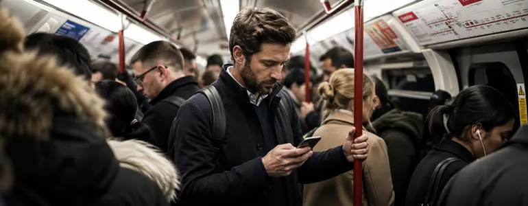
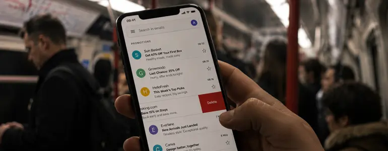
I’m on the train, coffee in hand, looking at all the emails that have arrived overnight and I’ve got one goal: get rid of that little red notification number on my email app. Welcome to swipe-a-geddon. Swipe. Delete. Swipe. Delete. Swipe. Delete.
I’m brutal. Even brands I like aren’t safe. Your subject line has a few seconds to make me stop, and if it’s so long that half of it has been cut off, I’m probably not going to spend time piecing together what you wanted to say.
But even getting me to open doesn’t mean you’ve won my attention.
When I have more time to look at emails on my phone, I often open one and immediately start scrolling. I’ll quickly scan down the email before swiping all the way back to the top if something catches my eye.
I’m not really reading at that point. I’m looking for a reason to stop. And that’s the problem with treating mobile email as a smaller version of desktop.
A responsive email can technically work perfectly on a phone and still be a poor mobile experience. The columns might stack. The images might resize. The copy might fit on the screen. But none of that means you’ve designed for how someone uses their phone.
Mobile is a different environment, with different behaviours and far less attention. Good mobile email design isn’t simply about making your desktop email fit a smaller screen. It’s about designing for the person holding it.
And sometimes that person is on the 7:30am train, ruthlessly swiping away everything you’ve spent all day creating.
Subscribers aren’t sitting at a desk
One of the easiest mistakes to make when designing an email is forgetting the environment it’ll eventually be read in.
You’re probably building it on a laptop or large monitor. You’ve got a mouse, plenty of screen space and, most importantly, the email has your full attention.
Your subscriber might look at exactly the same campaign while standing on a train, waiting for the kettle to boil or half-watching something on TV.
They’ve got one hand, one thumb and considerably less patience. That’s why designing for mobile isn’t just about screen size. You have to design for a completely different level of attention.
An open doesn’t mean they’re reading
This is particularly important when we look at opens. Getting someone to open your email on mobile doesn’t necessarily mean they’ve stopped to read it. I’m a perfect example.
When I’m not in ‘morning swipe-a-geddon mode’ and an email does get my attention, I often open it and immediately start scrolling.
I’ll scan quickly down the entire email, almost without thinking, before heading back to the top if something has caught my attention. Thanks to Facebook, Twitter and every other infinite feed I’ve spent years scrolling through, I suppose.
The important bit for email marketers is that I’m not really reading during that first scroll. I’m scanning.
I’m looking for something that makes me stop.
A strong hero image. A big, clear headline. An interesting product. An offer. Something that gives my thumb a reason to take a few seconds off.
“On mobile, the first job of your email isn’t always to be read. It’s to stop the scroll.“
That means strong visual hierarchy becomes even more important. Your subscriber should be able to move quickly through the email and still understand what’s important, where one section ends and another begins, and what deserves their attention.
Mobile readers can be brutal. Your design needs to make their job easy.
Responsive doesn’t automatically mean mobile-friendly
Most modern email templates are responsive. That’s a good start, but it doesn’t mean the job is done.
An email can pass all the obvious technical checks. The columns stack. Images resize. Nothing disappears off the side of the screen.
And it can still be horrible to use on a phone.
Stacking isn’t the same as designing
The more complex your desktop design becomes, the more thought you need to give to what happens when all that content is squeezed into a single column.
Take a simple two-column block with an image on the left and copy on the right. Add another underneath with the copy on the left and image on the right.
It looks great on desktop.
Let everything stack automatically on mobile and you can suddenly end up with image, copy, copy, image. The visual pattern you carefully created on desktop has disappeared.
“That’s where techniques such as column swapping become important.”
You might need to deliberately change the order of your content on mobile so each image still sits alongside the copy it belongs to.
Three-column layouts can be even trickier. What looked like one neat row on desktop can become a very long section once those three columns are stacked on top of each other.
Sometimes, the best answer is to stop trying to make the desktop design work.
Sometimes mobile needs its own creative
Back in the day, when I worked on Sainsbury’s Online creatives, we’d regularly swap desktop hero images for dedicated mobile versions using CSS.
The desktop image had been designed for a wide space. Simply shrinking it down could make the product, message or focal point far less effective.
So mobile got an image designed specifically for mobile.
The same principle can apply to entire content blocks. If a particularly complex desktop section doesn’t translate well to a phone, it can sometimes be better to hide it on mobile and build an alternative version specifically for the smaller screen.
Of course, that takes more time and resources, and it won’t be necessary for every campaign and business. But it highlights an important distinction:
Responsive design asks: “Does this email fit on mobile?”
Mobile design asks: “Does this email still work on mobile?”
Those aren’t always the same thing.
Design mobile email screen-by-screen
There’s a long-standing idea that mobile emails need to be short. I’m not convinced they do.
I’ll happily scroll through a long email on my phone if there’s something worth scrolling for. Social media has trained most of us pretty well when it comes to moving through content. Length isn’t necessarily the problem.
“A long mobile email isn’t a bad mobile email. A badly structured one is.Give every screen something to do.”
Rather than thinking about the email as one long piece of creative, think about how it feels screen by screen.
As I scroll, is there something that catches my attention?
Can I immediately tell what’s important?
Do the imagery, headlines and calls to action give the email a clear rhythm?
Or does everything compete for attention at once?
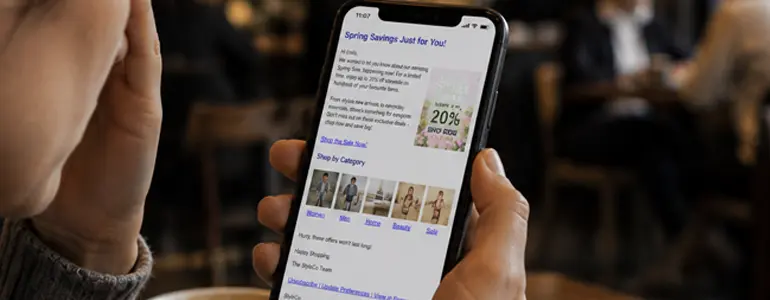
This is where a strong hero image and a big, clear headline can work particularly well. When I open an email on my phone, they’re often the first things that make me slow down and take notice.
The same thinking should continue further down the email.
You don’t need a CTA on every screen or a giant headline every few hundred pixels. But you do need enough visual hierarchy that someone can quickly scan the campaign without it becoming one long wall of competing content.
Don’t waste your first screen
The top of the email has an especially important job.
On desktop, you have the luxury of a much larger viewport. On mobile, your logo, hero image and headline can easily consume the entire first screen.
That’s fine if they’re doing something useful. It’s less fine if your subscriber has to scroll before they can even work out why you’ve emailed them.
Think about what someone can understand before that first swipe. They don’t necessarily need the whole story. But they should have enough information to decide whether the rest of the email is worth their attention.
Design for thumbs, not cursors
A mouse cursor is incredibly precise. Your thumb… less so.
Yet plenty of emails are still designed as though subscribers will carefully position a cursor over exactly the right piece of linked text.
On mobile, everything needs a little more room. Make the important things easy to tap.
Buttons should look and feel like buttons. Text links need enough space around them. And if you’ve got several clickable elements sitting close together, make sure your subscriber can comfortably tap the one they want.
We’ve all experienced the frustration of trying to tap one tiny link and accidentally opening the one next to it.
It’s even worse when an email hasn’t been properly optimised for mobile and you find yourself pinching and zooming just to read the copy or hit a CTA.
This is something I still see surprisingly often in B2B emails.
An image hasn’t been sized correctly, it blows out the width of the email and suddenly the entire campaign looks broken on mobile.
Text becomes tiny, the layout stretches and the subscriber is left zooming in and moving around just to understand what’s going on.
At that point, you’ve made reading your email hard work. And mobile readers aren’t exactly known for their patience.
Make your copy comfortable to read
The same principle applies to your copy.
A paragraph that looks perfectly reasonable on a large desktop screen can suddenly feel dense and difficult to read when it’s squeezed onto a phone.
Font size is the obvious place to start. As a general guide, I like to work around:
H1: 28-32px
H2: 24-28px
H3: 20-24px
Body copy: 16px
These aren’t rules. Your typeface, brand guidelines and email design will all influence what works. The important thing is to look at your typography on a phone rather than assuming the desktop sizes will translate nicely.
And please don’t forget about line height!
Give your copy room to breathe
Line height doesn’t get anywhere near the attention it deserves in email design.
You can choose a perfectly readable 16px body font and then make it unnecessarily difficult to read by cramming each line of copy against the next one.
It’s something I see all the time on mobile.
Give your text room to breathe. For body copy, a line height somewhere around 1.5 to 1.6 times the font size is usually a good starting point. So, if you’re using 16px body copy, you might be somewhere around 24-26px for your line height.
Again, that’s a starting point, not a rule. What matters is how it feels when you read it on an actual phone.
The same goes for your headings. They need enough space to breathe, but be careful with enormous desktop typography carrying over to mobile. A 48px headline might look fantastic on a large screen and then take up half the viewport when someone opens the email on their phone.
I’ve seen exactly that happen in real campaigns. Everything technically worked on mobile, but nobody had adjusted the headline sizes, resulting in ridiculously large headings dominating the email.
Responsive? Yes. Good mobile design? Not really.
And don’t assume making everything smaller is the answer either.
Good mobile typography is about finding the balance between readability, hierarchy and space. Your subscriber should be able to immediately distinguish a headline from a subheading and body copy without any of it becoming uncomfortable to read.
Don’t waste the click
If someone has stopped scrolling, found something they’re interested in and tapped it, you’ve done the hard work. Congrats!
But don’t make them work for the next bit. If I see a jacket I like in a B2C email and tap the image, I expect to land on the product page for that jacket.
Not the jackets category. Not the homepage. Not a page containing 57 different jackets where I now have to find the one that caught my attention in the first place.
Take me to the thing I tapped.
I’m perfectly happy buying on my phone when the journey is that simple. Product, basket, checkout. But make me start searching for the product again and there’s a very good chance I’ll just close the website.
The same rule applies to B2B
The conversion might be different, but the principle isn’t. If someone taps a webinar in your email, take them directly to the registration page.
If they tap a blog, take them to the article. If they want to download a guide, take them to the guide.
If they’ve decided to book a demo, don’t make them hunt around your website trying to work out how.
For many B2B campaigns, reading the article or registering for the event is the conversion you’re trying to achieve.
You’ve already persuaded someone to stop what they’re doing on their phone and give you their attention. Don’t throw that away by adding unnecessary steps.
“Every extra tap between the email and what someone wanted is another opportunity to lose them.”
Think beyond the email
Thankfully, completely unusable mobile websites aren’t as common as they once were. Responsive web design has come a long way.
But that doesn’t mean we can stop testing what happens after the click. Follow the journey yourself.
Does the right page open?
Is the content they clicked for immediately obvious?
Is a form comfortable to complete on a phone?
Can they complete whatever action you’re asking them to take?
It’s another reason why judging an email campaign purely by the email itself can be misleading. As we’ve seen with why email campaigns fail and how to fix them, the experience doesn’t end when someone clicks your CTA.
The email got them there. The rest of the journey still has to finish the job.
Test on a phone, not just a preview window
Most email platforms give you some form of mobile preview, and they’re incredibly useful while you’re building a campaign.
But a preview window isn’t a phone. Before an important campaign goes out, send yourself a test and use the email on your phone.
Scroll through it
Tap the buttons
Read the copy
Look at how much of the hero you can see on the first screen
Check whether those carefully spaced content blocks still feel carefully spaced when you’re holding them six inches from your face.
“You’re not just looking for things that are broken. You’re looking for things that are annoying.”
Test the experience
There are two different types of testing worth thinking about here:
Rendering tests help answer: “Does my email display correctly?”
Using the email yourself helps answer: “Is this actually nice to use?”
Both matter.
An email might render exactly as you intended and still have a headline that feels enormous, a paragraph that’s uncomfortable to read, a CTA that’s awkward to tap or a hero image that takes three swipes to get past.
Those aren’t necessarily rendering problems. They’re usability problems.
It’s also worth checking your campaign in dark mode, particularly if your email relies heavily on brand colours, transparent images or carefully chosen contrasts. What looks great in your standard mobile inbox might behave very differently when dark mode gets involved.
Give someone else the phone
And don’t make yourself the only person who tests it.
By the time you’ve finished building an email, you already know how it’s supposed to work. You know which button you’re meant to tap. You know which section matters. You know what the headline is trying to say.
Someone seeing it for the first time doesn’t have any of that context. That’s why I always recommend getting another person to test the campaign before it goes out.
As I covered in my email QA checklist, AKA the Assumption Test, you don’t need a second pair of eyes because you’re careless. You need them because you’re too close to the campaign.
Give someone else the email on their phone and let them scroll, tap and interact with it naturally. If they struggle with something, your subscribers probably will too.
Good mobile design is often good accessible design
There’s a lot of crossover between designing an email that’s easier to use on mobile and designing an email that’s more accessible.
Larger readable text helps someone using a small screen. It also helps someone with reduced vision.
Generous line height makes paragraphs easier to digest on a phone. It also helps people with dyslexia and other cognitive or visual impairments.
Clear visual hierarchy helps someone rapidly scrolling through an email. It also makes the content easier to understand and navigate.
Larger buttons are easier to hit with your thumb. They’re also easier for people with reduced dexterity.
Good colour contrast matters when you’re reading your phone outside in bright sunlight. It matters even more for someone with a visual impairment.
“A lot of what we call mobile optimisation is simply making an email easier for a human being to use.”
Don’t make mobile accessibility an afterthought
This is another reason why accessibility shouldn’t be something you check once the design has already been built.
If your starting point is readable typography, clear hierarchy, sufficient spacing and obvious calls to action, you’ve already solved a lot of potential mobile and accessibility problems before testing even begins.
There are, of course, accessibility considerations that go much further than mobile design. Semantic structure, ALT text, screen readers and the growing role of AI all deserve attention in their own right, which I’ve covered in more detail in email accessibility for humans and AI.
But there’s a useful principle here.
“If you make an email easier to see, read, understand and interact with on a phone, there’s a good chance you’re making it easier for more people to use too.”
The mobile assumption test
Before you send your next campaign, put the desktop preview away for a moment and open the test email on your phone. Then ask yourself:
Can I understand what the email is about from the first screen?
If I immediately start scrolling, is the visual hierarchy strong enough to make me stop?
Can I comfortably read the body copy without zooming, and does the line height give it enough room to breathe?
Can I easily tap every important button and link with my thumb?
Does the content still make sense after columns have stacked or changed order?
Is anything taking up far more screen space than it deserves?
When I tap something, do I land exactly where I expected to?
If you answer no to any of those questions, don’t just ask whether the email is responsive. Ask whether it’s been designed for mobile.
Mobile email design isn’t about squeezing a desktop campaign onto a smaller screen.
It’s about recognising that the person holding that screen is behaving differently.
They might be commuting. They might be watching TV. They might have 30 seconds to clear their inbox before a meeting. Or they might be me at 7:30 in the morning, ruthlessly swiping away perfectly good emails in pursuit of that beautiful little red zero.
You can’t control the situation your email arrives into. But you can design for it.
Make the subject line worth stopping for. Make the first screen work hard. Give your content a clear visual hierarchy. Make the copy comfortable to read and every important action easy to tap.
Then get the email onto an actual phone and use it.
You’ve succeeded when the experience makes sense to the person holding it.
Andy Gilhooley |Digital Marketing Manager
Andy has been coding emails and running multichannel campaigns for over 20 years. He loves talking about email campaigns and testing the boundaries of interactive email content.
How do experienced email marketers avoid sending ‘Oops’ emails?
Andy Gilhooley07-07-2026
Every email marketer has sent an email they'd love to take back. However, experienced marketers make fewer mistakes. And that’s because they build processes to catch them.
Most subscribers never read your email. Here’s why they still matter
Andy Gilhooley14-07-2026
What if the majority of your subscribers never opened your emails, yet your campaigns still influenced future purchases? Discover why inbox impressions matter just as much.