
More conversions with email: 21 techniques for better-scoring emails
When your emails are earning opens and clicks, that’s a good start, but you want to convert your readers into sign-ups for your event, into downloaders of your document, into buyers in your shop or into readers on your site.
There’s a wide range of factors that influence how well an email converts; the layout of the email, the presence of images, the use of buttons, the attractiveness of the text, the headings and many other aspects.
But your conversion will also benefit if your forms are optimised, your landing pages are clear and your automated campaigns work. But also don’t forget to take a critical look at the target audience that receives your mail. Because no matter how great everything around your sent mail is, a morning reader may not want to wait for the online evening edition of your newspaper.
So there is a lot you can think about to improve the conversion rate of your mailings. What works and what doesn’t? How do the different choices work alongside each other? Keep reading to ‘convert’ yourself into a conversion king/queen!
Get more out of your existing database
The right mail to the right person at the right time. When it comes to conversion optimisation, you already have three elements to work on. But who are they, these ideal readers?
Ideal readers: readers who will be delighted by your mail
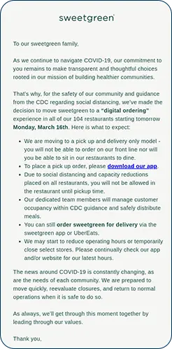
It is well known that bulk mailings score poorly. They don’t make your readers happy. “One send fits all” has long since ceased to work in email marketing; it’s better to create two separate emails with two different messages specifically targeting one segment each time than putting both messages in one big email. The idea of “something for everyone” does not hold true in email marketing.
If you want more conversions, you need to dive into segmentation and personalisation. In this example from OpenTable, a resident of Nashville, Tennessee receives an email with specific information about local restaurants that have recently been added to the platform.
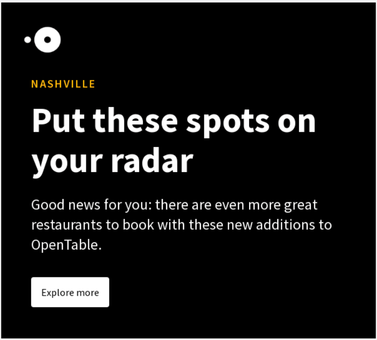
How far would you typically travel to dine out at a restaurant? 30 minutes? 1 hour? As OpenTable has customers across the United States, this particular email will be of no interest to a significant percentage of them. So they don’t receive it.
And the more specific, the better. For example, this email lists a few different kinds of dining spots; OpenTable could use previous browsing or booking data to narrow down its readers’ favourite cuisines or styles, and offer more closely targeted recommendations.
Ideal readers: readers who expect your mail
Segmented mailing is a good start for increased conversion. You thereby ensure that readers appreciate your emails. One step further in conversion optimisation is to send emails that readers not only enjoy but also expect. And think to yourself, which emails you always expect. That list will probably cover order, reservation, and payment confirmations, as well as monthly or weekly recurring emails, emails you signed up for, and any emails that fit within a campaign you’re following.
For example, if you sign up to receive a newsletter, you expect a welcome email. And these emails also score well. To illustrate, some ratios of welcome emails from our own customer base:
- A bicycle manufacturer (producer): open ratio 78% and click ratio 30%
- A franchise organisation in flowers, plants and garden products (retail): open ratio 72% and click ratio 45%
- A webshop in cosmetics (eCommerce): open ratio 78% and click ratio 48%
High ratios don’t just apply to welcome emails. Birthday emails, product review emails, invitation emails for recurring events, or evaluation emails are also good converting emails. In fact, all emails that your readers expect score well. It’s worth highlighting that all these emails are ones that can and should be automated; automation and high-performance go hand in hand when you’ve set things up properly.
Ideal readers: readers who should expect your mail
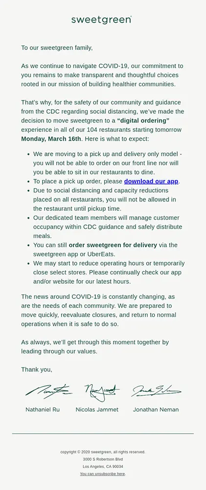
Sometimes you receive emails that you did not immediately expect, but that do match your search activities on certain websites or the data you left behind. For example, if you sign up for a customer event, you may not expect an extensive introductory email about the speaker, but if you do receive such an email, you may find the information very valuable.

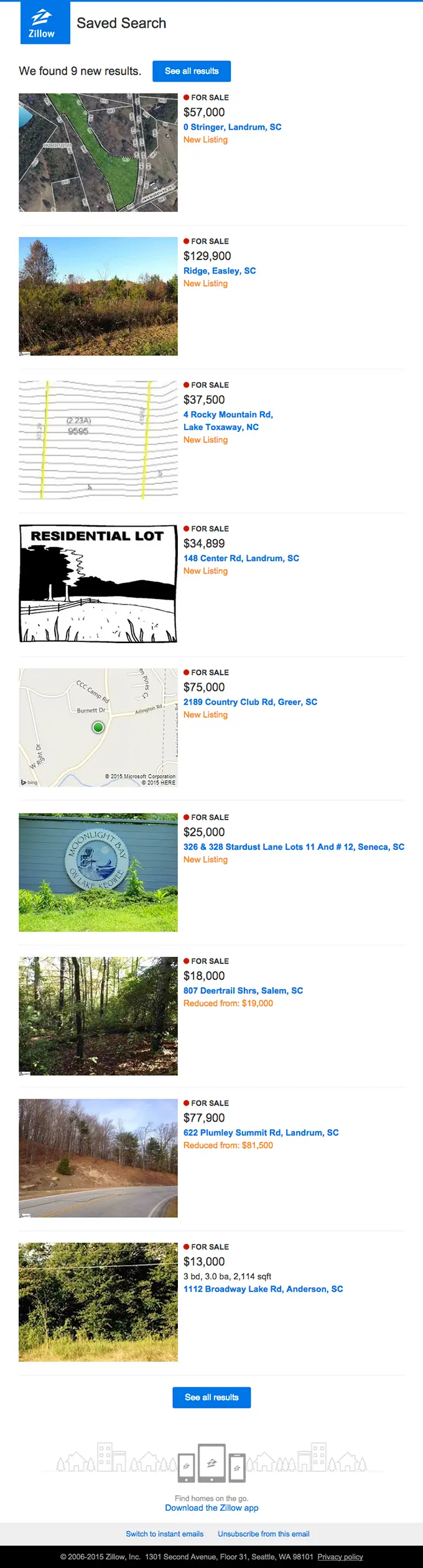
Or something more commercial: property website Zillow sends you an alert when their newest listings match one of your previous saved searches. With such an important purchase, criteria like location and number of bedrooms may be a starting point, but you will probably be looking for “exactly right” rather than “close enough”. So a regular update offers value.
Building relationships with potential customers through ongoing communication is known as lead nurturing. Emails that are part of a nurturing campaign often score well because they connect to a particular stage in the potential customer’s buyer’s journey and demonstrate that an organisation is active rather than passive in serving its customers’ needs. This makes it more likely that the potential customer will eventually purchase the company’s product or service the moment he or she is ready to make that purchase. For increased conversion, it’s a good idea to delve into lead nurturing.
How to stand out in the inbox?
If you know how to send the right email to the right people at the right time, it’s then important that your beautiful targeted email stands out in your reader’s inbox. And almost every inbox reveals three chunks of information about the email received: who sent the email, what the content of the email is, and what the first piece of text of the email is. Or else: the sender name, subject line and snippet. For increased conversion, this must make a positive impression in the recipient’s inbox.
Standing out in the inbox: a sender name that scores
The sender consists of two parts. The sender name and the reply address. In the example below, the sender is Daniël Verhagen | Happy Leads and the reply address is <happyleads@e.happyhorizon.nl>

Make sure your sender name and reply address match the type of mailing you are sending as closely as possible. The mail from Happy Leads makes it clear what Happy Horizon stands for, and Daniël Verhagen always sends the mails from his own name, which makes them stand out in the inbox.
In short, if you want to improve the conversion of your mail, start with your sender name and your reply address. Needless to say, avoid reply addresses like noreply@address.com. This not only looks impersonal, but also unsympathetic.
Standing out in the inbox: a powerful subject line
The subject line is by far the most important of the three inbox fields. Research by Perficient, among others, found that 69% of readers determine whether an email is interesting enough to open based on the subject line. And the latter, of course, is vital if you want to entice readers to click on a call-to-action. What can you do?
Write actively
Ensure your subject line prompts action. The colon in TikTok: the newest generation of advertising is a good way to excite the reader. If you look at it linguistically, you can cast the subject line in the following eight active variations: with a colon, in the imperative, using adjectives, with a question, as an announcement, as a short main sentence and via a double message.
Some examples:
- Double Point TikTok: Have you been running ads?
- Area wise Don’t forget to advertise on TikTok
- Adjective Now extra attention to TikTok and advertising
- The question Who doesn’t advertise on TikTok?
- Announcing TikTok the newest advertising channel
- The short main sentence Advertising on TikTok takes off in a big way
- The double message Advertisements on TikTok? | Is yours already there?
So Happy Leads could have chosen from eight variations of the same message. Which of these works best is, for the most part, impossible to predict in advance. Don’t always use the same type of subject line, but vary and test. That way you will gain insight into the effect and know which type of subject line scores best.
Experiment with symbols
A subject line consisting only of symbols is especially striking. Whether something like this works for you, of course, is something you need to investigate. It is always possible to run an A/B split test on your subject line. We know from practice that the correct use of symbols can increase your open rate precisely because it makes your mail stand out more.
Experiment with personalisation
Personalisation in the subject line can also increase your open rate. For example, you could address someone directly in the subject line, but maybe you know something else about your recipient that would be useful, such as their job title. Again, this is great to try out in an A/B split test. And again, email practice shows that personalisation is a good way to increase the ratios of your emails.
Standing out in the inbox: a snippet that supports your message
The snippet is the short text that, along with the sender name and subject line, is seen first and immediately displayed on smartphones. Here, too, you can spark the reader’s interest:

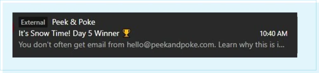
You don’t often get email from marketing@theinsightsfamily.com, which will do little to increase your open rate. A sound snippet reinforces your subject line. In doing so, it helps to lift the tip of the veil that hangs over the content of your email.
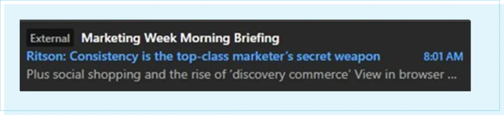
Proper use of the snippet should further stimulate the recipient’s curiosity. Plus, social shopping and the rise of ‘discovery commerce’ build upon the subject line, giving the recipient more reasons to open the email.
The advantage here is that, in several email clients, the snippet remains visible even if the email has not been opened yet.
Which emails do we like?
Emails that you can read clearly on your device, emails that consist of images that complement the text, and emails with clear calls-to-action are the kind of thing we like to receive. Additionally, emails are easy to scan because they use different content blocks filled with simple text. Different eye-tracking studies have made it clear that our eyes primarily fixate on these email elements.
Beautiful emails: attractive and responsive design
Over half of all email is now read on a smartphone. Therefore, your email should be designed for smaller screens. Content that does not fit on this narrower screen can be resized, hidden or placed one below the other.
Keep in mind that a mobile reader will often read briefly between items. This usually happens on the go, in an environment full of distractions. Make sure your mobile email is concise, catchy, and compelling.
Beautiful emails: clear and varied content blocks
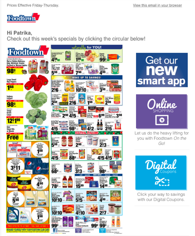
Foodtown’s email has some whitespace, but this design is still far too crowded and overwhelming to the eye. In contrast, Gorgias have used larger whitespace to separate their content blocks and make the email readable, while still delivering multiple value points.

Beautiful emails: good copy and the right images
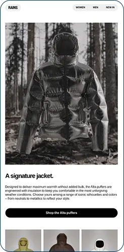
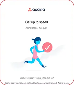
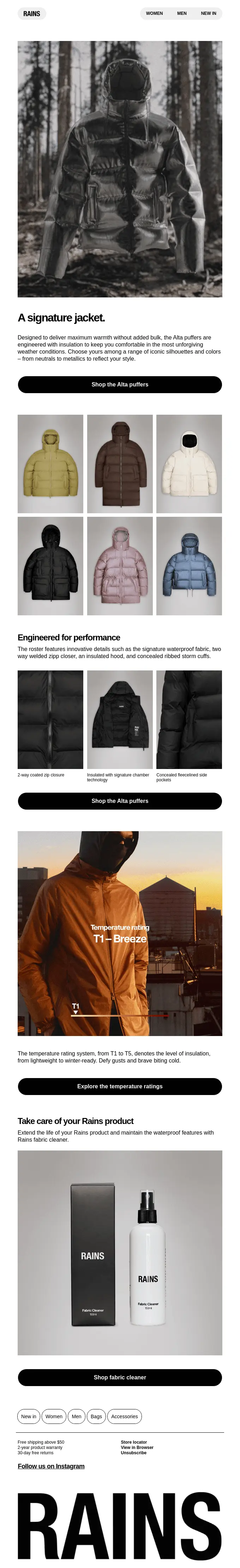
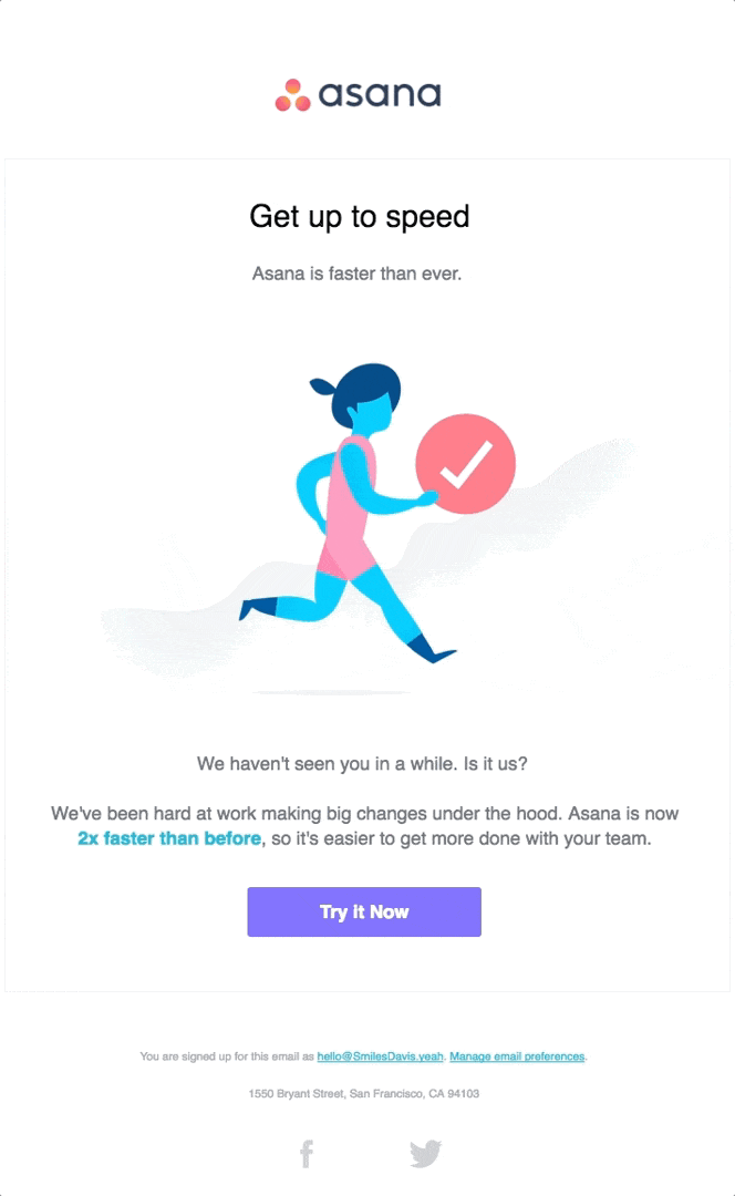
You know the drill: emails with a lot of text and few images or the other way around. Goatstack.AI have gone for a lot of text, Asana has gone for minimalism. Choosing one variant or the other obviously depends on your reader’s preferences and how your organisation prefers to communicate, but there’s more to it.

If you have many Outlook readers who primarily read your emails on a desktop, it is unwise to include a lot of content in images. Outlook doesn’t show images by default. Your readers have to download those first. Calls-to-action, however, are often shown, so it is wise to make them stand out.
However, if you have a lot of iPhone users who always receive images razor-sharp on their screens, then an image-based option can perform well. For both your open rate and click rate, the ratio of image to text and how you display your main buttons can be important.
Beautiful emails: clear and different calls-to-action
For increased conversion, you do need to prompt your readers to take action. This almost always takes the form of a button to your website, web store or landing page. This is the most important element of the email and should therefore stand out. Many readers are used to clicking on buttons, so it is a good idea to design the call-to-action as a button.
How to create converting landing pages?
You’ve selected the right target audience, paid attention to the inbox fields, and your email excels in both design and readability, but it’s a shame if your landing pages are a mess. Make sure your LPs are not conversion killers. Pay adequate attention to this element of your mailing as well, because clear and uncluttered landing pages increase conversions.
Converting LPs: help your reader scan
A landing page is a single web page that looks somewhat like a “normal” website page, but is not. A landing page is much more organised and distracts the reader much less than a website page. After all, a landing page is much more focused on conversion than a “normal” website page and often requires one clear action from the reader.
Landing pages are clearly focused on conversion
The fact that a landing page is clearly focused on conversion is immediately evident in its layout. A good landing page has one clear call-to-action (CTA) and not multiple CTAs like a regular website page.
Research from Litmus and Unbound makes it clear that one CTA on a landing page also produces the highest conversion rate. The average conversion rate is 13.8%, and with each additional CTA, this conversion rate decreases. With two CTAs, you are already at 11.7% and with three at 10.3%, according to this study.
Landing pages target a specific reader action
You can also say that a landing page is a logical extension of a specific reader action. You can often see this logic in the linking of calls to action. Downloading from your email is usually followed by requesting on the landing page, and signing up can be thought of as the follow-up action, which is subscribing.
Landing pages often show a form
On almost every landing page, you’ll find a form where readers can fill in the desired data. The call-to-action in your email should make it “logical” for readers to check and complete this data.
Converting LPs: use one relevant image
Take a look at the landing pages for our resources and webinars. We keep both the copy and the form super short, so the reader’s attention is drawn to what we want them to do: fill in the form to either sign up for the webinar or receive the resource.
Converting LPs: make sure they are responsive
What applies not only to your emails but also to your landing pages is that your LPs should be easy to read on all devices. After all, it would be a shame if your mail is nicely responsive, but your landing page is not.
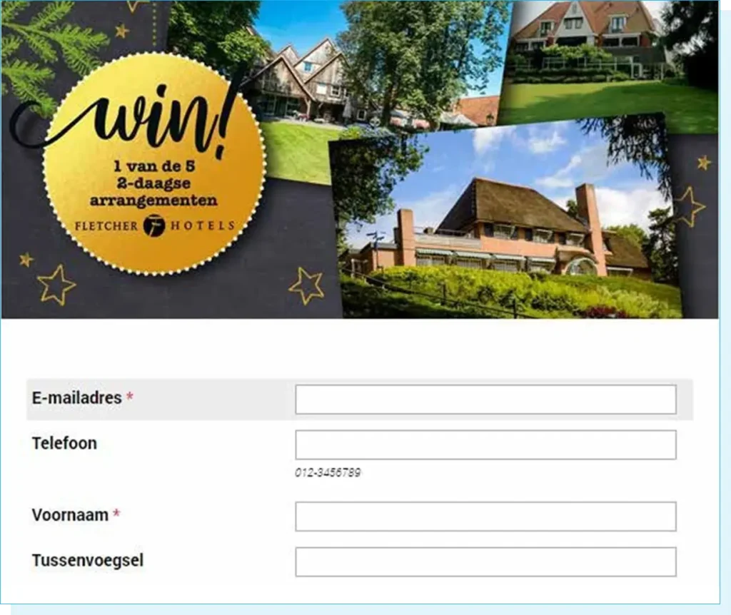
On a smartphone, of course, your fill-in fields should have plenty of space. Dierspecialist.nl’s landing page has a lovely responsive template with a finger-friendly design:
What forms are most user-friendly?
When a form has all known data already filled in, suppose a form has only a few questions. When a form kindly corrects you if you make a mistake. And one for the reader and more for the creator: put forms on a nice landing page. That can be better for conversion.
User-friendly forms: always on a landing page
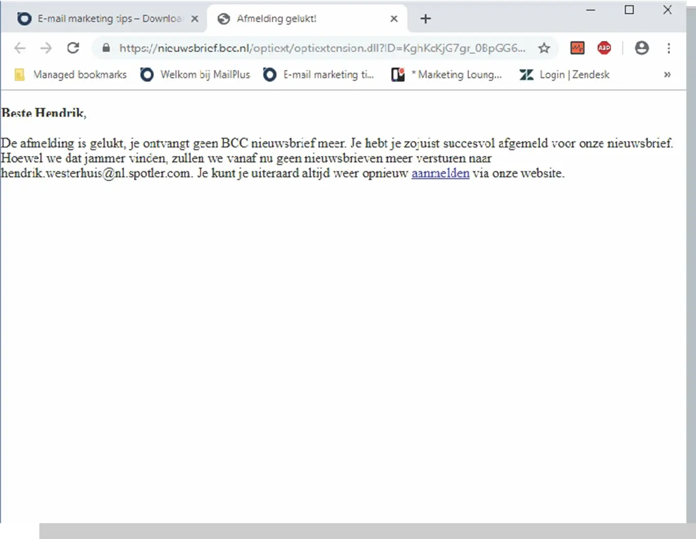
Why should your forms be on dedicated landing pages? Refer to the CreditNinja example and the BCC example.
CreditNinja lets you “land” on a page where the layout of the unsubscribe form matches their corporate identity, and you can temporarily unsubscribe. It is even possible to adjust the sending frequency.
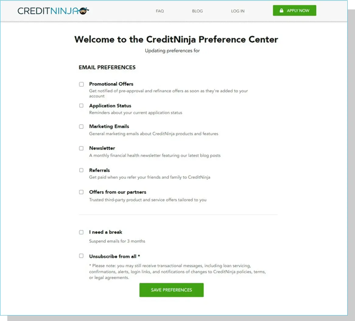
All very clever, because this way you might not lose your reader completely. And the latter could still be an admirable conversion goal for your unsubscribe form: retaining a small percentage of your subscribers. At CreditNinja, you can do that; at the BCC, you can no longer do so. Of course, you can place a form “bare” in an email, but you don’t do that very quickly. Forms are placed on a page. Therefore, you are more likely to create them with attention, which can be beneficial for your conversion rate.
User-friendly forms: preferably prefilled
In the example below from our Netherlands website, ‘Sign up for inspiration’ is selected, and all known data are already filled in; the Company Name field is highlighted with a blue bar. These are small details that make your form easier to complete. Especially when readers sign up or want to change their mail preferences, any support increases conversion. The easier you make filling out a form, the more likely readers will fill in the missing data and click the call-to-action.
User-friendly forms: as few questions as possible
Consider this form:
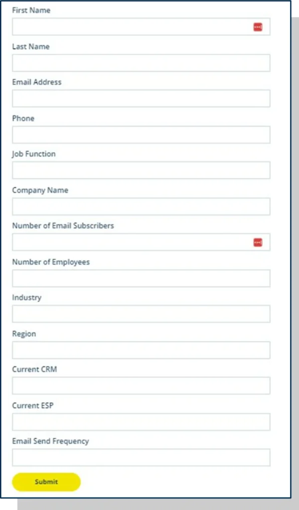
Everything we’d like to know about a potential customer in one go. Perfect, right? Except, nobody’s going to spend that much time and give away that much information for a newsletter they haven’t seen yet.
All we really need to know at this stage is their email address. We’ll learn more about them by the content they interact with once they start receiving our emails. Keep your forms short, and you will benefit in the long run.
User-friendly forms: with friendly error feedback
However many fields you decide you need in your form, some of your audience will make mistakes filling them in. If this happens, your form should provide feedback on the error to help them correct it. Always ensure that your feedback text is positive and clearly specifies what readers need to fill in. To create effective forms, don’t forget to incorporate this feedback. It’s a small effort, and you increase the number of well-filled forms. And the latter leads to less annoyance, fewer potential dropouts and that will improve your conversion rate.

How to get more out of your mail statistics
Suppose you’ve thought carefully about the selection and personalisation options for your target audiences and potentially automated campaigns.
And you’ve taken a critical look at your inbox fields, the layout of the mail, the landing pages, and you haven’t forgotten about the forms you place on them, either. In terms of conversion optimisation, you’ve come a long way by now. But if you want to know exactly which techniques work for your target groups, you still have one more hurdle to take: learning from your mail statistics.
Better metrics: chart ratios
Review the metrics of your emails to identify which ones are performing well. Did they decrease, increase or stay the same? Calculate your average open rate, click rate and conversion over, say, a year and contrast that with what your recent mailings are doing. Are you above your own average? Then you’re doing well.
Better metrics: take another critical look at your audience selection
If you notice a downward trend in your mail statistics, first check whether the mails you compare are sent to the same target group each time. You want to avoid comparing apples with oranges. It is best to make a separate comparison for each specific target group.
It is also essential to look at the sending times of the emails you are comparing. If there are significant differences, try to determine whether the timing of the send could have influenced the conversion. You don’t want to tinker with your buttons, content blocks, subject lines, or any other part of your emails if the solution to increase conversion is to change the time of sending.
If you are certain that you have conducted a thorough comparison between different emails and have identified a downward trend in your ratios, then there are several aspects in your emails that you can address. From our experience, we know that two key strategies can significantly improve your emails: a scan test and social sharing.
Better metrics: do the scan test
The scan test is a quick and proven means of assessing whether your email is clear and immediately understandable. Consider this email from Away:
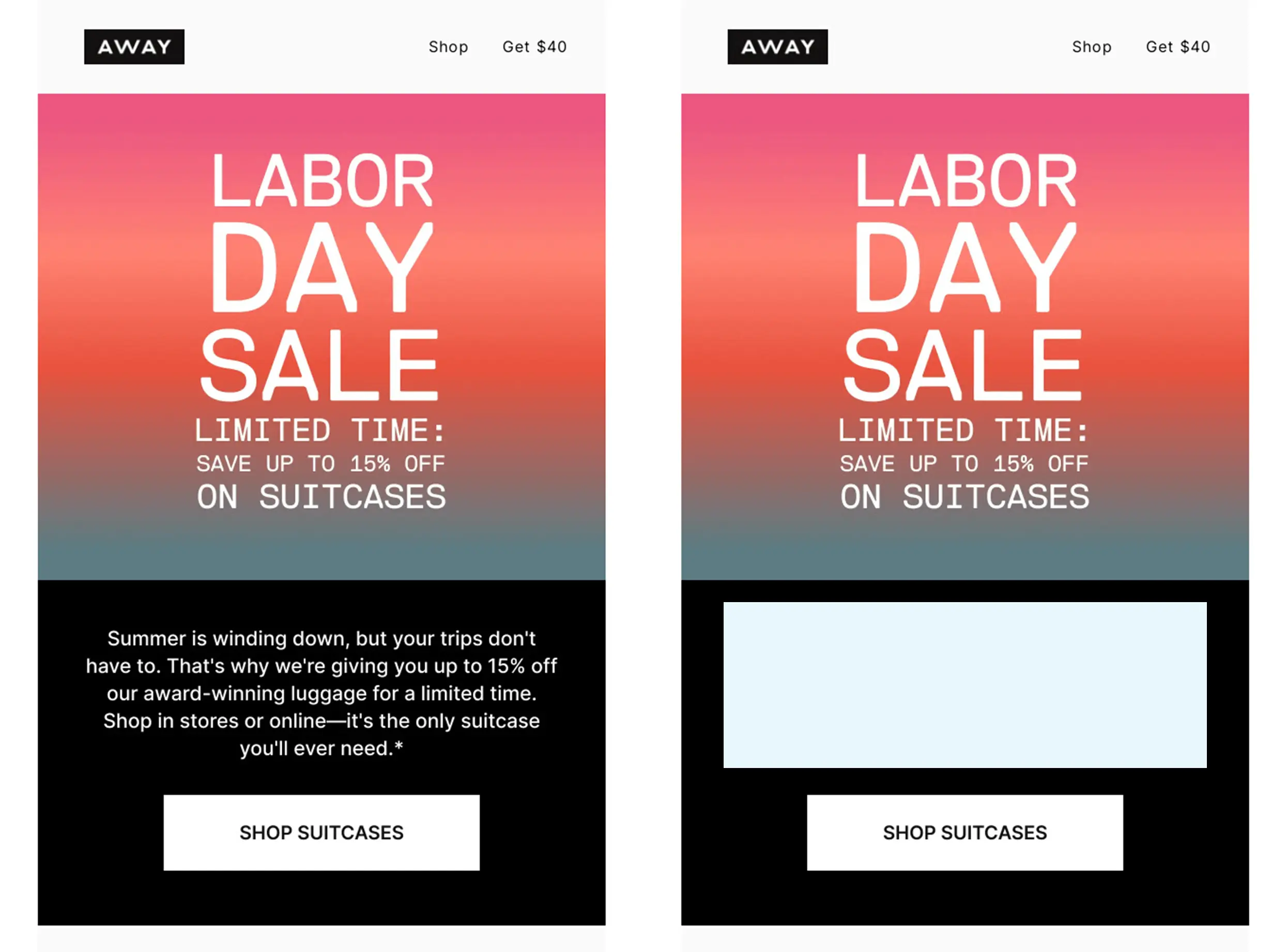
If you remove all the running text, you are left with the following information:
- Sender: Away
- Subject line: Our best-selling suitcases are on sale
- Header: Labor Day Sale
- Call-to-action: Shop suitcases
The purpose of the email is pretty straightforward. You get to read the purpose at least three times. The running text adds extra details, but isn’t necessary to convey the email’s purpose. This check is also known as the eight-second rule. At most, your audience gives your email eight seconds of attention. Often less. So your message must be clear enough to be understood at that time.
The more scannable the email, the better your click rate will look. You can think of the click as a reset timer; you get a similar amount of time for your landing page to capture the reader’s attention.
Better metrics: add social sharing
And add social sharing. It’s just often forgotten, and that’s a shame. By adding social sharing icons to articles, readers can easily share the article on their social media channels. This allows more people to see and click on the link, which is interesting in terms of the viral effect of the news.
All you have to do is fill in the title, URL and description of the social link for each article. The description is essential for X so that people don’t have to fill in anything themselves to tweet the news item. Adding social sharing can also have a positive effect on your click rate, and therefore, potentially your conversion rate.
The conversion ladder checklist
1. Optimal: readers who are delighted by your mail.
Segment your database and personalise your mailings to better match specific characteristics of your recipients.
2. Optimal: readers expecting your mail.
Monthly recurring emails, emails you signed up for and all emails that fit within a campaign are emails your recipients expect. Therefore, set up automatic campaigns.
3. Optimal: readers who can expect your emails.
Sometimes, you receive emails that you don’t immediately expect, but which are consistent with your search activities on certain websites or the data you have left behind. These mails often score well, too. Therefore, think about lead nurturing and lead scoring.
4. Use a sender name that scores.
Make sure your sender name and reply address match the type of mail you are sending as much as possible.
5. Write a powerful subject line.
Write actively, experiment with symbols and personalisation, and test the effect of your subject line in an A/B split test.
6. Use a snippet that supports your message.
With your snippet text, further awaken readers’ curiosity and prevent a reader from seeing only “read online”.
7. Mails in an attractive and responsive design.
Keep the mobile reader in mind and ensure the mail is easy to read on both small and large screens, and is formatted in a recognisable design.
8. Use clear and varied content blocks.
Readers tend to scan, and this approach works well when there is ample white space between content blocks.
9. Good copy and the right images.
Nothing is more annoying than officious and distant language and images that don’t fit the text. Pay attention to that.
10. Mails with clear and different calls-to-action.
For increased conversion, you need to prompt your readers to take action. This almost always takes the form of a button to your website, web store or landing page. But don’t forget to add text links and image links as well.
Landing pages
11. Help your reader scan.
A landing page is really focused on conversion. Therefore, use one CTA and place one clear form on it.
12. Use one relevant image.
It’s best to use your image to show what the reader receives after clicking on Apply, for example, or you add an image of the location next to a button with Sign up for event.
13. Make sure they are responsive.
What applies to your emails also applies to your landing pages. Make sure your landing pages display well on every size of screen.
Forms
14. Place your forms on a landing page.
That looks neater, fits the mail better and increases readers’ willingness to fill them out.
15. Prefill forms.
The fewer readers have to fill out, the more likely your forms will lead to conversion. Therefore, prefill your forms with known data from your database.
16. Ask as few questions as possible.
Readers like that.
17. Use friendly error feedback.
This really works to increase conversion rates. Clearly indicate what a reader needs to enter, and what will cause an error.
Follow-up
18. Chart your current ratios.
Know what to expect and when your emails are scoring well. Then you have a good starting point for expected conversion.
19. Take another critical look at your target audiences.
Conversion starts with segmentation and personalisation, but perhaps one selection scores better than another. Can you identify the differences and learn from them?
20. Take the scan test.
Are your emails easily understood if you remove all running text and leave only headings, images and buttons?
21. Add social sharing.
If readers can share your articles, then more readers can enjoy your hard email work. That can be positive for your click and conversion rates.
More conversions with email
Do you have questions after reading this guide? Or would you like to learn more about what email marketing automation can do for your organisation? Check out spotler.com or visit our blog with even more practical information on various topics related to newsletters and marketing automation: spotler.com/blog
Or sign up for our email newsletter at spotler.com/newsletter. You will then receive knowledge about email marketing and the latest news from Spotler on a monthly basis.