Building an email has never been easier. Modern email builders allow marketers to create professional-looking campaigns without writing a single line of HTML.
Not so long ago, building an email meant learning enough HTML and CSS to be dangerous. Today, you can build and send campaigns without touching code at all.
But there’s a downside. The freedom these tools provide means there are fewer guardrails.
Years ago, many marketers worked from fixed templates. The structure was already there, the spacing had been considered, and the typography was consistent. Most of the hard design decisions had already been made.
Today, you can drag, drop, resize, recolour, rearrange, and customise almost every part of an email. That’s powerful. It’s also why some truly terrifying emails make it into the inbox.
I’ve seen emails with five different fonts, six competing calls-to-action, paragraphs centred for no apparent reason, and enough content blocks to require a table of contents.
Good email design still relies on the same principles it always has:
Clarity
Hierarchy
Readability
Accessibility
And understanding how people scan email
The good news is you don’t need coding skills to get those things right. You just need to know what decisions matter.
Let’s start with the most important one.
Start with the goal, not the layout
The most common mistake a marketer can make is opening their email builder and immediately starting to build.
An image gets dropped in, followed by a heading, some copy, a button, another image, and before long the email is halfway built despite nobody stopping to think about what it’s actually trying to achieve.
Modern email builders make it incredibly easy to add content. That’s one of their biggest strengths. Unfortunately, it’s also why so many emails end up trying to do too much.
For example:
Read a blog
Register for a webinar
Download a guide
Follow social channels
Explore a product
Contact the sales team
All in the same email.
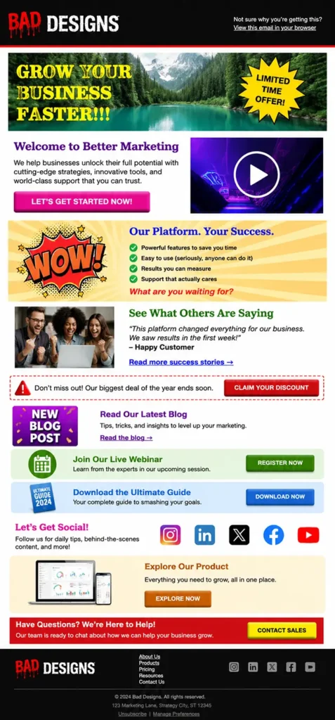
An example of an email containing too many competing messages. The lack of focus can overwhelm users, making it difficult to know where to look, what to prioritise, and which action to take.
The problem isn’t that any of those actions are bad. The problem is that they’re competing for attention.
The best-performing emails are focused. They have a clear objective, a clear message, and a clear action they want the reader to take next. Everything else supports that goal.
That’s why I always encourage marketers to answer one simple question before they even think about the design: What do I want somebody to do after reading this email?
Once you’ve got an answer, the rest becomes much easier.
The layout, the imagery, the copy, and the CTA all start working towards the same outcome rather than competing with each other.
Good email layouts start with knowing what success looks like.
Respect the reading pattern
One of the biggest mistakes in email is assuming people read emails. Most don’t. They scan them.
Think of your own behaviour when tidying up your inbox and going through unread messages. Of the ones you bothered to open and not instantly delete, I bet you didn’t read any of them from start to finish. Even the important ones!
Most people decide within a couple of seconds whether an email is worth their attention. They’ll glance at the headline, look at any imagery, scan a few lines of copy, and decide whether the email is worth their attention. If they can’t quickly understand what the email is about, it’s swiped into the deleted items folder.
That’s why hierarchy is so important.
The most important information should be the easiest thing to find. A strong headline should introduce the message, supporting copy should add context, and the call-to-action should be easy to identify without hunting for it.
A simple structure often works best:
Headline
Supporting copy
Call-to-action
Problems usually start when every part of the email is competing for attention. Multiple headline styles, oversized images, competing colours, and sections that don’t have a clear purpose make it harder for readers to understand where they should focus.
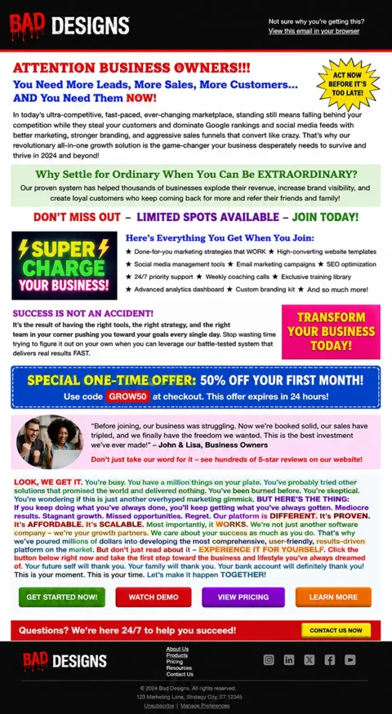
An example of an email that uses too many colours, font styles, and heading treatments. With every element competing for attention, there is no clear visual hierarchy, making it difficult for users to identify the most important action.
“One of the easiest ways to improve an email is to open it on your phone and scroll through it quickly. Don’t read every word. Scan it like a busy customer would.“
Can you immediately understand:
Who the email is from?
What it’s about?
Why it matters?
What you’re expected to do next?
If not, the problem is usually the way the information has been organised.
Good typography makes emails easier to read
Most email conversations focus on images, colours, layouts, and buttons. Yet most of the email is still made up of words. If your email isn’t comfortable to read, it doesn’t matter how good the rest of it looks.
Over the years, I’ve seen marketers spend ages debating subtle colour tones and about 30 seconds thinking about the typography. The result is often an email that’s visually attractive but unnecessarily difficult to read.
There are a few fundamentals worth getting right.
Font size
If somebody has to zoom in to read your email on their phone, that’s a bad start!
As a general rule, body copy should be at around 15-16px. This creates a much better reading experience across devices and helps make emails more accessible for everyone.
Font choice
I’ve seen emails with different fonts for headlines, body copy, buttons, product names, and even individual sections of the same email. It usually ends up looking less professional, not more.
A good rule of thumb is to keep things simple:
One font family for body copy
One font family for headings (if different)
Consistent sizing throughout the email
A clear hierarchy between headings, subheadings, and body text
Most brands can create an entire email using a single font family and a handful of carefully chosen sizes.
A heading font with some personality paired with a simple, readable body font usually works well.
Line spacing
This is the one that hurts my eyes and my heart. One of the quickest ways to make an email feel difficult to read is to cram the lines together. If the text feels like it’s fighting for space, then you’ve lost the reader.
Giving your copy room to breathe makes a huge difference. A line height of around 1.4 to 1.6 times the font size is usually a good starting point.
The goal of line height is to make those words easier to consume.
Alignment
For most marketing emails, left-aligned text wins.
It’s easier to scan, easier to read, and generally creates a more comfortable reading experience. A centred headline can work well, but multiple paragraphs of centred copy often become hard work for the reader and is not accessible to all.
If you’re asking people to read more than a sentence or two, left alignment is the safer choice.
Contrast
Grey text on a slightly lighter grey background might look sophisticated in a design mock-up. It looks considerably less sophisticated when nobody can read it.
Strong contrast improves readability, supports accessibility, and helps ensure your content remains clear across different devices and viewing environments.
An example of an email that contains too much copy, with text set at an unreadably small size and little to no line spacing. The result is a dense wall of text that is difficult to scan, hard to read, and unlikely to hold the reader’s attention.
Break up your content
Large walls of text can feel intimidating, even when the content itself is valuable.
Use headings, shorter paragraphs, bullet points, and spacing to make your content easier to navigate.
Readers should be able to scan an email and quickly understand the key messages before deciding whether to read in more detail.
Good typography practices makes your message easy to read, easy to understand, and easy to act on.
Please stop sending one giant image
Every email marketer has seen it. A beautifully designed image created in Canva or Photoshop containing the headline, the body copy, the call-to-action, and sometimes the entire campaign squeezed into a single graphic.
The image gets uploaded into an email builder, stretched to full width, and sent. Job done. Except it isn’t.
The problem with image-only emails is that they sacrifice many of the things that make email such an effective channel in the first place.
For example:
Screen readers struggle to interpret the content
Text can’t be resized by the reader
Dark mode can’t adapt the content
AI has a harder time understanding the message
The email becomes harder to read on mobile devices
If images are blocked, the content disappears entirely
That’s not to say images don’t have a place. They absolutely do. Strong imagery can support a message, create visual interest, and reinforce a brand.
The problem starts when the image is the email.
An example of a visually well-designed email that has been built as a single image rather than using live HTML text. This creates significant accessibility issues, prevents AI tools from understanding and referencing the content, and means users who have images disabled may see nothing at all.
One of the biggest advantages of modern email builders is that they give you access to proper semantic headings, text blocks, buttons, spacing controls, and responsive layouts.
So, it’s always a disappointment when people use all those tools to recreate a static flyer.
“If your entire message only exists inside an image, you’re giving up many of the benefits that email provides.“
Less is usually more
One of the biggest strengths of modern email builders is flexibility. You can add sections, columns, images, buttons, videos, social links, dividers, countdown timers, and almost any other content block you can think of.
The problem is that it’s very easy to use all of them!
Sometimes this means emails feel less like a marketing campaign and more like a tour of every feature available in the builder.
Multiple layouts, endless content blocks, competing messages, and enough buttons to make the recipient wonder whether there was going to be a test at the end.
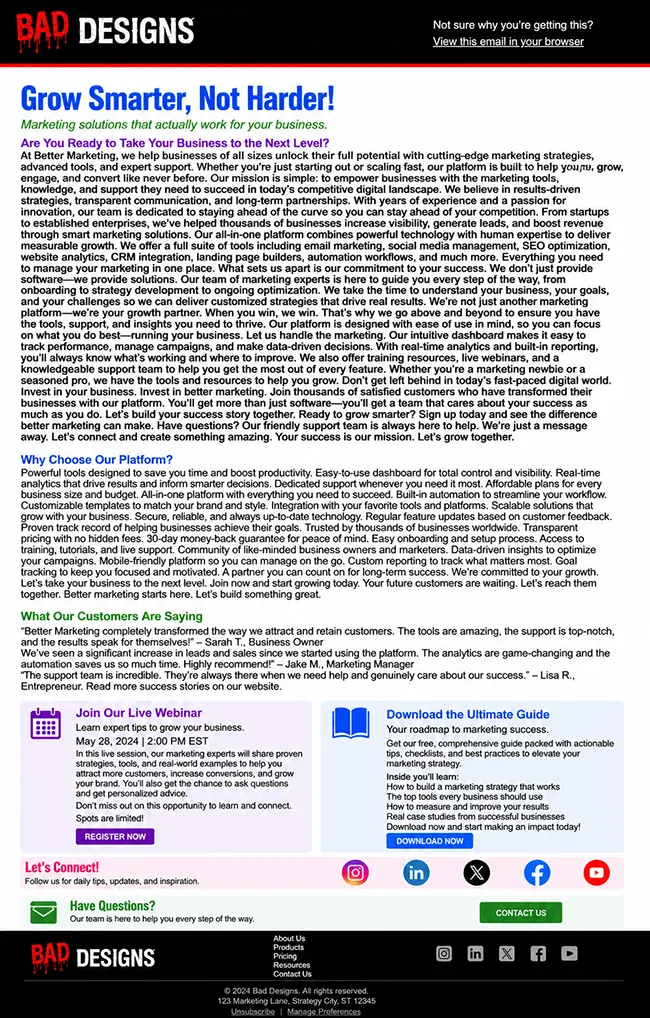
An example of an email that relies on too many layout variations, multiple columns, and competing CTAs throughout. This creates unnecessary complexity, leading to confusion and reducing the likelihood that users will take action.
The irony is that more content rarely creates more engagement. In most cases, it creates more confusion.
When readers open an email, they’re usually asking themselves the following:
What’s this about?
Why should I care?
What do they want me to do next?
Every additional section, image, offer, or CTA makes those questions slightly harder to answer.
That’s why some of the best-performing emails are surprisingly simple.
They focus on a single message and give it room to breathe. Rather than trying to communicate everything at once, they prioritise the information that matters most.
This is where spacing becomes incredibly important too.
One of the easiest ways to improve an email is often to remove something rather than add something.
A section that’s repeating information
An unnecessary image
A second CTA that’s distracting from the primary goal
Good email design is about making deliberate choices about what deserves attention. If you’re ever unsure whether a section belongs in your email, try removing it and see if the message becomes clearer. Quite often, it does.
Design for mobile first
The reality is that most people aren’t sitting at a desk carefully reading your campaign on a large monitor. They’re checking emails while watching TV, commuting to work, standing in a queue, or scrolling through their inbox between meetings.
Your email needs to work in those moments. That means designing for smaller screens from the very beginning. A few simple principles go a long way:
Use readable font sizes – 15-16px is the recommended minimum
Give buttons enough space to tap comfortably – aim for a touch target of around 44-48px
Avoid cramming multiple columns with too much content
Make sure images scale correctly
Keep your layouts simple and easy to follow
A good example of mobile-first design, with appropriately sized text and buttons, clear touch targets, and content that is easy to scan and digest on smaller screens.
One of the biggest mistakes I see is trying to squeeze desktop thinking onto a mobile screen. The email might look fantastic on a laptop, but the moment it’s viewed on a phone the text becomes cramped, the hierarchy disappears, and the reader is left zooming in and out trying to work out what’s going on.
The frustrating part is that mobile-friendly design isn’t particularly difficult anymore as modern email builders do the heavy lifting for you.
The challenge is remembering that mobile isn’t a secondary experience. For many recipients, it is the experience.
Consistency beats creativity
One of the biggest traps with modern email builders is the number of design options available. The temptation is to use them – all of them.
The intention is usually good. Marketers want the email to feel creative and engaging.
The problem is that inconsistency increases cognitive load. Readers have to spend more time figuring out how the email works and less time consuming the content.
When every section looks different, readers will struggle. When every button has a different style, it becomes less obvious where the primary action is. When every heading is a different size, the visual hierarchy starts to break down.
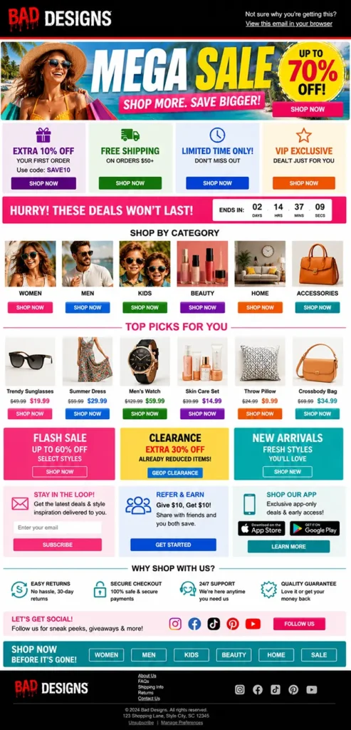
A good example of email consistency: a clear, compelling headline that communicates the message instantly, followed by a short paragraph and a single CTA focused on one action. Simple, focused, and easy to act on.
Consistency creates confidence. That’s why most strong email designs rely on a simple design system:
A small number of font sizes
Consistent spacing between sections
A limited colour palette
One primary button style
Predictable layouts
Readers shouldn’t be spending their time figuring out how your email works. They should be spending their time consuming the content.
“The best emails are not always the most creative, they’re the easiest to understand.“
And, of course, test before you send
You’ve planned the email, built the layout, refined the typography, optimised it for mobile, and resisted the urge to turn it into a giant image.
Now comes the part many marketers rush through – testing.
It’s tempting to assume everything is working because it looked fine in the builder. Unfortunately, the inbox has a habit of exposing things that weren’t obvious during the design process.
A button link goes to the wrong page
An image doesn’t load correctly
A heading wraps awkwardly on mobile
Dark mode does something unexpected
A typo survives three rounds of review and somehow becomes visible to everyone five minutes after hitting send. It’s practically an email law. Most of these issues are easy to fix before launch and incredibly frustrating to fix afterwards.
Before sending check:
Links and CTAs
Mobile rendering
Dark mode rendering
Personalisation and dynamic content
Accessibility considerations
Spelling and grammar
Image quality and alt text
It’s also worth sending yourself and a colleague a test email and viewing it as a recipient would, in a real inbox, on a real device.
You’ll often spot things that seemed perfectly fine during the build process. Looking directly at you, Outlook.
The good news is that testing doesn’t need to take long. A few extra minutes before sending can save hours of explaining afterwards.
Getting a colleague to review and test the email is gold. They’ll almost certainly pick up something you’ve missed because you’re simply too close to the campaign to be completely objective.
And unlike many areas of email marketing, this is one of the easiest performance wins available. Nobody ever complains that an email was tested too thoroughly.
Good email design was never about code
One of the best things modern email builders have done is make email marketing more accessible. You no longer need to learn HTML and CSS before you can create professional campaigns, which means more marketers can focus on the message rather than the code behind it.
But while the technical barriers have largely disappeared, the design decisions haven’t.
You still need to think about hierarchy, readability, accessibility, mobile devices, imagery, typography, and how people consume content in the inbox.
The tools can help you build an email, but they can’t always tell you whether you’re building the right one.
The good news is that high-performing emails are rarely the most complicated. They don’t need every design feature, every content block, or every creative idea squeezed into a single campaign.
More often than not, they focus on a clear message, present it in a way that’s easy to consume, and make the next step obvious.
That’s good email design. And it doesn’t require a single line of code.
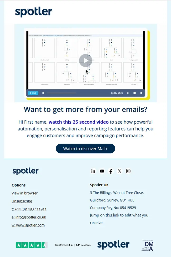
Making email campaigns easier
With Spotler Mail+, tools like the Brand Manager allow teams to create reusable templates with the correct structure, colours and components already in place.
That makes it easier for marketers to build campaigns that stay consistent, readable and accessible so you never have to worry about your emails looking bad ever again.
Andy has been coding emails and running multichannel campaigns for over 20 years. He loves talking about email campaigns and testing the boundaries of interactive email content.
Email marketing held its ground in 2025. Open rates edged upward, click behaviour recovered, and marketers spread their campaigns more evenly across the year.
