Imagine this: you’ve spent months preparing for your event. Speakers are booked, agendas are locked, and the coffee order is in. But your attendees still seem confused. They’re searching their inboxes for venue info, wondering who’s speaking when, or hoping they didn’t miss a last-minute change. It’s not that they don’t care. It’s that they don’t know where to look.
Too often, critical event details are lost in a digital scavenger hunt of fragmented emails and dusty downloads. That shiny app you commissioned? Most people never even opened it.
Enter the event website. Done well, it becomes your event’s living, breathing nerve centre. It is not just a static page but an evolving tool that welcomes your audience before they ever walk through the door.
Why your website adds value to your event
Let’s start with what doesn’t work.
Emails, for all their immediacy, fall short regarding continuity. Yes, they’re fine for pinging out reminders. But once that information is read, it is buried under three dozen unread threads. It’s practically gone. And if you’re sending separate updates for speaker announcements, venue directions, and last-minute programme tweaks, your audience will have to piece everything together like a jigsaw puzzle.
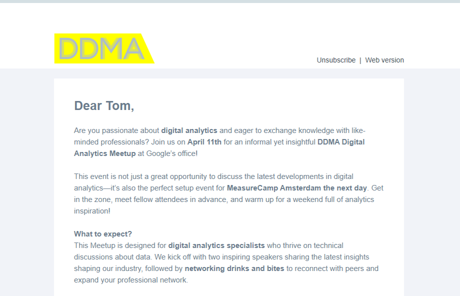
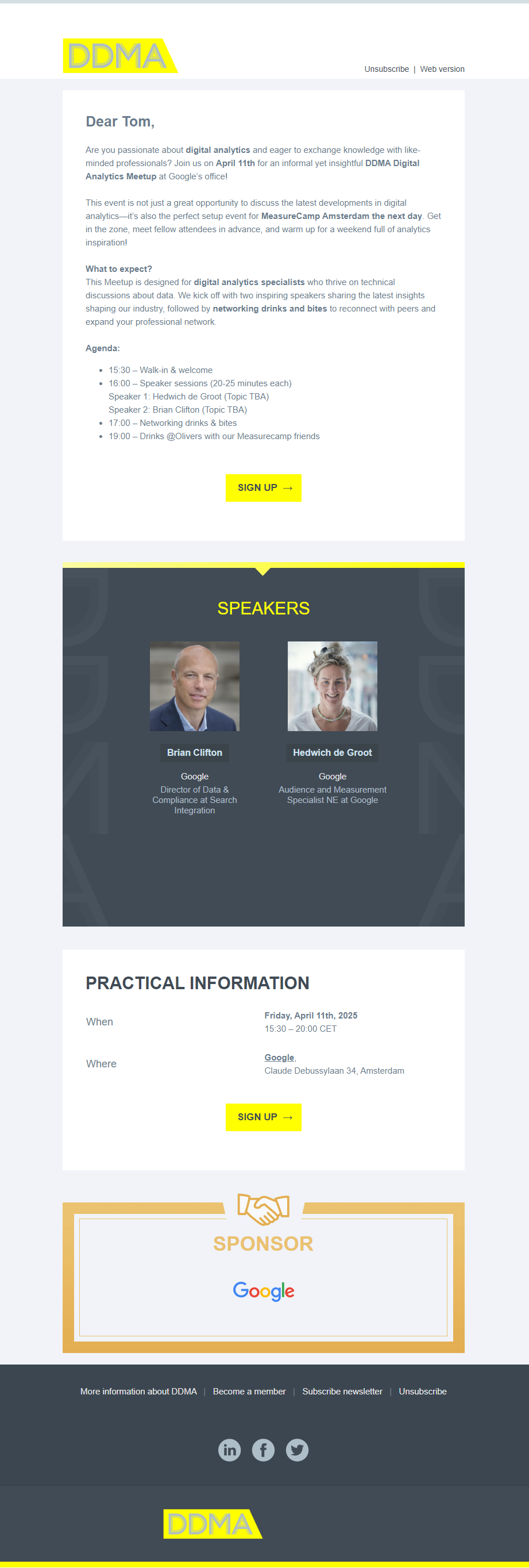
This event invitation email from DDMA contains a lot of information
Then there’s the app problem. Apps have their place, but for a four-hour or single-day B2B event? That’s a tough ask. Expecting someone to download, learn, and remember to use an app for such a short window is like asking them to pack for a weekend trip using only their coat pockets. It’s not impossible. It’s just inconvenient. And in events, inconvenient translates to overlooked.
On the other hand, websites are the middle ground we’ve all been craving. They’re accessible from any device, always up to date, and easy to share. They don’t ask much from your audience and give much in return.
What makes a great event website?
First, it’s got to be clear. No one should land on your homepage and wonder what the event is about, or whether they’re in the right place. That clarity starts with a strong visual identity: a banner image that sets the tone, communicates the theme, and includes the essentials: event name, location, date. You don’t need a design degree, but you do need a bit of restraint. Limit your colours. Guide the eye. Make space for your call to action.
Build the subpages first. That might sound backwards, but it works. Flesh out the programme, speaker bios, and location details, then pull the key bits onto the homepage like the highlight reel it is. Your homepage is the handshake. The other pages are the conversation.
Content-wise, be helpful, not heavy. Think about what your attendees want to know. Don’t bury the why of your event in paragraph three. Make the value obvious. Tell them who they’ll meet, what they’ll learn, and how to get there. And if things change? (They always do.) Update the website. Often.
When someone visits your site, they’re looking for reassurance. Reassurance that they’re making the right choice. That they’ll fit in. That the trip will be worth it. Good content doesn’t just inform, it builds trust.
Know what’s happening using analytics
After your site goes live, your job isn’t done; it’s just beginning. Data shows you what your attendees care about. Maybe the speaker page is getting all the clicks, or perhaps no one’s looking at the venue map. That’s insight you can use. Not just for this event but for the next one, too.
You’ll also see which devices people are using. Spoiler: it’s probably their phones. Which means your mobile view should be more than an afterthought. Make it sleek. Make it fast.
And don’t stop communicating after the lights go down. Follow up with a thank you. Share slides, photos, and videos. Ask for feedback. A simple text with a link to the site on the morning of the event can cut down on no-shows and keep everyone in sync.
Let’s be honest. Your event website is no longer optional. It’s not a digital flyer or a “nice to have” on a checklist. It’s your front door, your control room, where your event begins.
So make it worthwhile. Make it beautiful. Make it work.
Want to see how the pros do it? Companies like KLM, Gemeente Amsterdam and ServiceNow use Spotler to create smart, stunning event websites that help their events run better. Get a demo!
