A test email lands in your inbox. The images load, the layout looks good and you are ready to press send. But have you checked what your contacts will actually receive?
At marketingSHOWCASE Bristol, our Product Evangelist Kristian Tucker shared five common email mistakes and practical ways to fix them. His session focused on the checks and choices that can easily slip when a campaign deadline is approaching.
From broken links to messages that disappear when images are blocked, here are the key takeaways to use in your next campaign.
1. Treating a test email as the whole checking process
Sending yourself a test is a useful starting point. A quick look at your own inbox, though, will not confirm that the personalisation, links and audience are all correct.
Kristian illustrated this with a sample coffee campaign. The test looked ready to send, but the contact version had a blank first name, a link to the previous month’s offer and the whole database selected as its audience.
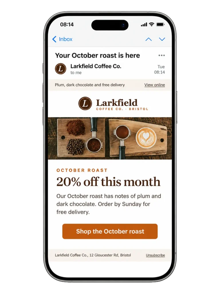
These are easy details to miss when you have spent hours building an email. Make checking them a routine part of preparing every campaign. Preview the message using contact data, check what happens when a name is missing and confirm who will receive it.
Try this tomorrow: Ask someone else to click every link. Give them the campaign goal and intended audience so they can check the journey as well as the layout.
2. Changing the design before finding the problem
When a campaign falls short, it is tempting to rewrite the email or change the button colour. First, look at where the problem starts.
If fewer people open an email, review the audience, timing and inbox delivery. A design change cannot help someone who never sees the message.
If people open but do not click, consider whether the offer is relevant and whether the next step is clear. Then follow the link yourself. Does the landing page deliver what the email promises? Checking the full journey helps you identify problems beyond the email itself.
Try this tomorrow: Check the audience and delivery before changing the creative. Use what you find to choose a specific change you can assess in your next campaign.
3. Asking one email to do too much
A sale, a product launch, an event, three blogs and a survey. Each might deserve attention, but putting them all in one campaign leaves the reader to decide what matters most.
In Kristian’s example, a busy promotional email became a focused message with one headline, a short explanation of the offer and a clear button. The purpose was immediately easier to understand.
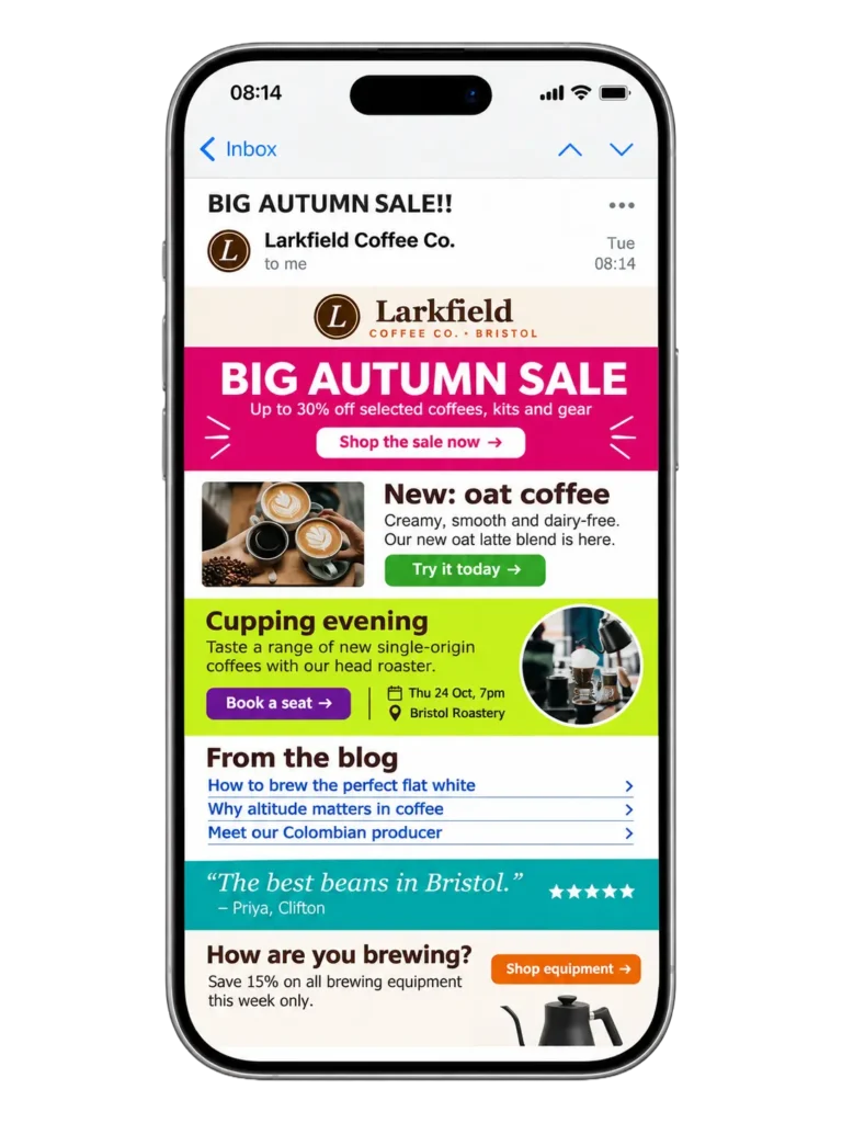
Before adding another section, ask what you want the reader to do. For a sale campaign, that might be to shop the offer. For an event invitation, it might be to register. Give that action priority and remove content that distracts from it.
Try this tomorrow: Give your next campaign one main job. Write that job in a sentence, then check whether every section supports it.
4. Assuming responsive means easy to use on mobile
An email can resize correctly on a phone and still be frustrating to read. A large logo and image might fill the first screen, leaving the headline, offer and button out of sight.
Kristian showed how changing the order of the content could bring the message and action into view sooner. A clear headline, a brief explanation and a button that is easy to tap give readers a useful starting point.
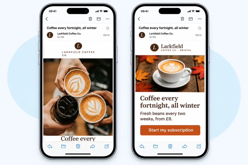
Look beyond whether the layout fits. Can you understand the offer quickly? Is the text comfortable to read? Can you tap the main button while holding your phone in one hand?
Try this tomorrow: Send the email to your phone and use it with one thumb. Check the first screen before you scroll, then follow the link through to the landing page.
5. Hiding the message inside images
An image can bring a campaign to life. But if your headline, offer and button are all part of that image, the message may disappear when images are blocked.
The session’s gift card example made this clear. With images switched off, the original email lost its key content.
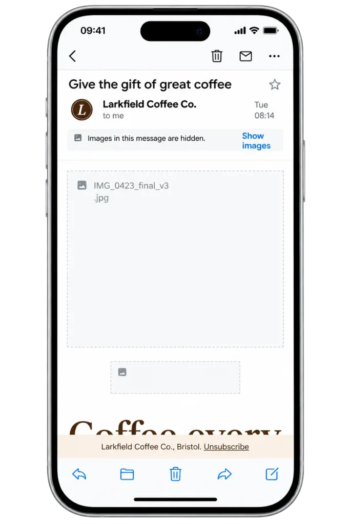
A revised version kept the headline and offer as live text, added useful image descriptions and used a button built in HTML.
That meant the essential message remained available without the images. It is also a useful starting point for accessibility: write meaningful alternative text for informative images and keep key information in readable text. Switching images off is one practical check within a wider accessibility review.
Try this tomorrow: Turn images off in your email client. Can you still understand the offer and take the next step? If either disappears, rebuild those parts using live text and an HTML button.
Make these checks part of your next send
You can try all five fixes with your next campaign. Ask a colleague to check the links, review the audience before redesigning, choose one main action, test on your phone and switch the images off.
Build those habits into your campaign process so they happen before every send. They give you a clearer view of what your contacts will receive and make it easier to spot the changes your emails need.