
Dark mode isn’t a feature you can opt into or ignore. For a growing number of users, it’s how they prefer to read email. And I’m one of them. As soon as Windows and Apple provided dark mode OS, I jumped over to the dark side.
And since 2019, more and more users have switched to dark mode across devices, especially on mobile.
In many cases, email clients are applying it whether you design for it or not. That creates quite the challenge!
So, you’re no longer designing a single experience. You’re designing something that might be inverted, adjusted, or overridden entirely, depending on where it’s opened.
The same email can look polished in one inbox and completely unreadable in another.
This guide focuses on the practical side of what breaks and how to build emails that still look intentional when dark mode gets involved.
What dark mode does to your emails
Before fixing anything, it helps to understand what you’re dealing with. Email clients generally handle dark mode in three ways:
- No change: Your design is left alone
- Partial inversion: Some colours are adjusted to fit a darker UI
- Full inversion: Light backgrounds become dark, dark text becomes light
The problem is inconsistency. There’s no single standard.
So instead of asking “Does my email support dark mode?”, the better question is: “What happens to my email when I lose control of the colours?”
The biggest dark mode problem areas
Certain elements break more often than others. These are the ones worth paying attention to.
Logos (the usual failure point)
Logos are often the first thing to go wrong.
If you’re using a dark logo on a transparent background, it can disappear completely in dark mode.
If you’re using a light logo, it might end up glowing or clashing depending on how the background is handled.
How we handled it at Spotler
At Spotler, we solved this by adding a chunky solid white stroke around the logo and filled in the P, O and E counters with white.
It’s simple, but it works effectively.
- The logo stays visible on both light and dark backgrounds
- It doesn’t rely on client support
- It avoids needing multiple versions


Sometimes the fix isn’t swapping assets or creating a whole new version. It can be as simple as protecting the original.
Other common approaches
You’ll see a few variations of the same idea:
- Adding a light or dark stroke
- Placing the logo inside a solid container
- Using a subtle badge or background block
All of these do one thing: remove reliance on whatever background the email client decides to apply.
Swapping logos with CSS
Some brands go further and swap logos entirely in dark mode.
<meta name="color-scheme" content="light dark"> <meta name="supported-color-schemes" content="light dark">
@media (prefers-color-scheme: dark) {
  .logo-light {display: none !important;}
  .logo-dark {display: block !important;}
}
<!-- Light mode logo (default) -->
<img src="logo-light.png" class="logo-light" style="display:block;" />
<!-- Dark mode logo (hidden by default) -->
<img src="logo-dark.png" class="logo-dark" style="display:none;" />
This gives you full control visually, but there’s a catch.
It only works in clients that support prefers-color-scheme. Others, like the Gmail Web client, will completely ignore it.
Logo swapping is the cleanest solution visually, but not the most reliable technically.
In Spotler’s Mail+ Brand Manager, you can upload two logos, one for dark backgrounds and one for light backgrounds.
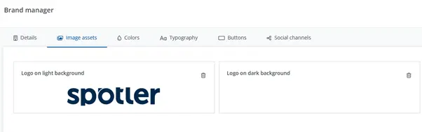
In the above example, we have the Spotler logo in its primary navy colour and also in a pure white colour.
Text and colours
Text can become unreadable surprisingly quickly.
- Light grey text can disappear on dark backgrounds
- Dark text can be inverted in unexpected ways
- Subtle contrast choices get lost
The safest approach is simple:
- Avoid low-contrast colour combinations
- Don’t rely on subtle differences between shades
If it’s hard to read in perfect light mode conditions, it probably won’t work at all in dark mode.
Images
Images don’t always invert cleanly.
- Bright images can feel harsh
- Dark images can lose detail
- Background-dependent visuals can clash
- If an image relies on a white background to work, it’s at risk.
Image transparency
Transparency is where things get unpredictable. A transparent PNG doesn’t control its background. The email client does.
That means your design can shift depending on how that background is handled.
If something relies on transparency to look correct, assume it can break.
Dark mode design strategies that hold up
You don’t need to design two completely separate emails. But you do need to design more defensively.
A few things that consistently help:
- Use mid-tone backgrounds instead of pure white
- Avoid extremes like #000000 and #FFFFFF
- Add background colours behind key elements
- Design for contrast resilience rather than precision
You cannot design or build a pixel-perfect email for both light and dark mode. Instead, change your mindset to one of designing for stability for both.
The uncomfortable truth: some brand colours don’t work in dark mode
There’s no nice way to say this. Some brand colours just don’t work in dark mode. Colours that were designed for white backgrounds can behave badly when that background changes.
They might disappear, become harsh, or lose all contrast.
- Pale greys can become invisible
- Bright yellows can feel aggressive on the eye
- Subtle brand tones can get overridden
A colour that looks “on brand” in light mode can look completely off in dark mode, even if you don’t change it.
Dark mode doesn’t replace your brand. It just adds another context you need to design for. Instead of relying on a single colour value, you’re working with a system that needs to adapt.
Creating a dark mode-friendly palette
A few practical ways to approach it:
Avoid extremes
Pure white and pure black tend to cause problems.
Use softened values instead:
#121212instead of#000000#F5F5F5instead of#FFFFFF
Create paired colours
Instead of one brand colour, define two:
/* Light mode */
--brand-primary: #0055FF;
/* Dark mode */
--brand-primary-dark: #4D8DFF;
Slight adjustments can make a big difference on darker backgrounds.
Design for contrast
Users don’t care if your blue shifts slightly from your brand guidelines. They do care if they can’t read your email, though.
Give important elements a background
Buttons, logos, and CTAs should never rely on the background colour to be visible.
When brand guidelines need to evolve
In some cases, supporting dark mode properly means updating brand guidelines:
- Approved dark mode variants
- Alternative logo treatments
- Contrast-safe colour pairings
You’ll instantly see in your inbox (if you use dark mode) brands that are handling dark mode the best, as they have adapted their palettes and their emails look great.
Coding for dark mode (where possible)
You can target dark mode in some clients. Just not all of them.
@media (prefers-color-scheme: dark) {
body {
background-color: #111111 !important;
color: #f2f2f2 !important;
}
.email-container {
background-color: #1a1a1a !important;
}
}
Using prefers-color-scheme
This works well for clients such as Apple Mail. It does not work everywhere, unfortunately.
Defensive coding of your background colours
<body style="margin:0; padding:0; background-color:#F2F2F2;">

  <table width="100%" border="0" cellspacing="0" cellpadding="0" bgcolor="#F5F5F5">
   <tr>
      <td align="center">
        <!-- Email container -->
        <table width="600" border="0" cellspacing="0" cellpadding="0" bgcolor="#F5F5F5" style="background-color:# F5F5F5;">
          <tr>
            <td style="padding:20px;">
              Your email content goes here
            </td>
          </tr>
        </table>
      </td>
    </tr>
  </table>
</body>
Some email clients will ignore or override your background colours in dark mode. You can’t fully prevent that, but you can reduce how much gets changed.
By setting background colours in multiple places, you give your design a better chance of holding together when dark mode is applied. And this prevents worst-case scenarios (like white text on white background)
A practical mindset for coding
- Inline critical styles
- Use
!importantwhere it matters - Assume some rules will be ignored
What this looks like in the inbox
I use dark mode every day, so I went through my own inbox to see how brands are handling this in practice.
When it goes wrong
Some patterns show up quickly:
- Logos disappearing completely
- Dark text on dark backgrounds
- Buttons losing contrast
- Images clashing badly
Some emails look like they were never tested in dark mode at all.
When it works well
The good ones are noticeably different:
- Logos stay visible
- Text is easy to read
- Colours feel intentional
- Nothing looks broken
They’re not perfect. But they hold together.
What separates the two
Bad emails:
- Designed only for light mode
- Rely on inflexible colour choices
- Assume full control
Good emails:
- Expect overrides
- Protect key elements
- Use flexible, safe design decisions
On the whole, most emails I receive to my iPhone work well in dark mode, including some of the examples I’ve shared below. However, some fare badly with Microsoft Outlook’s dark mode inversion effect. This is where a perfectly good light mode email can start to fall apart. Take a look.
Examples of dark mode inversion in Outlook
Logos
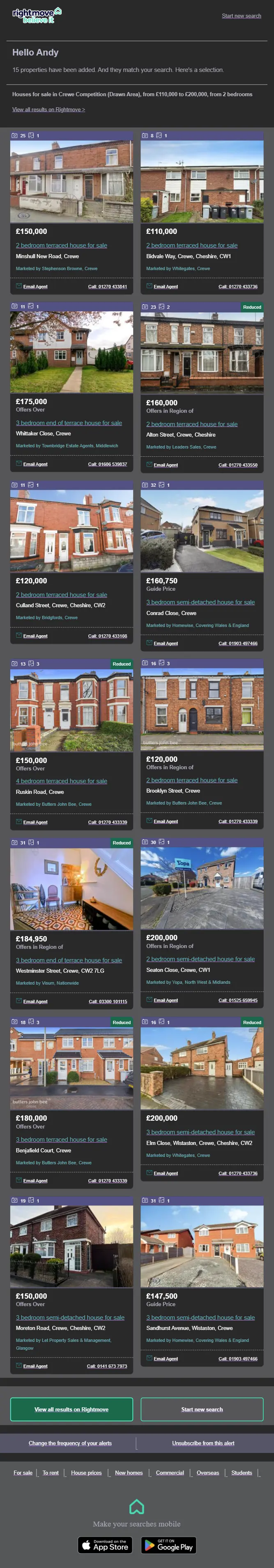
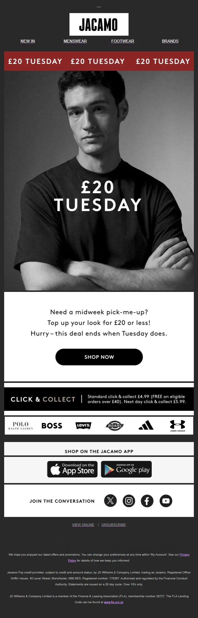
Rightmove use a white stroke around their logo to help the dark Rightmove element of the brand show in dark mode. However, it’s a little strong so dominates more than it should do. Whereas Tennis Point has applied a stroke with less thickness, which makes the logo pop perfectly in the header area of this email. Jacamo solves its dark mode logo issue by simply using a white background. Personally, this is my least favourite solution as it jars the overall design of the header area:

PayPal doesn’t adapt its pure black logo at all. The result is a hardly visible logo in the email header area:

Call-to-action
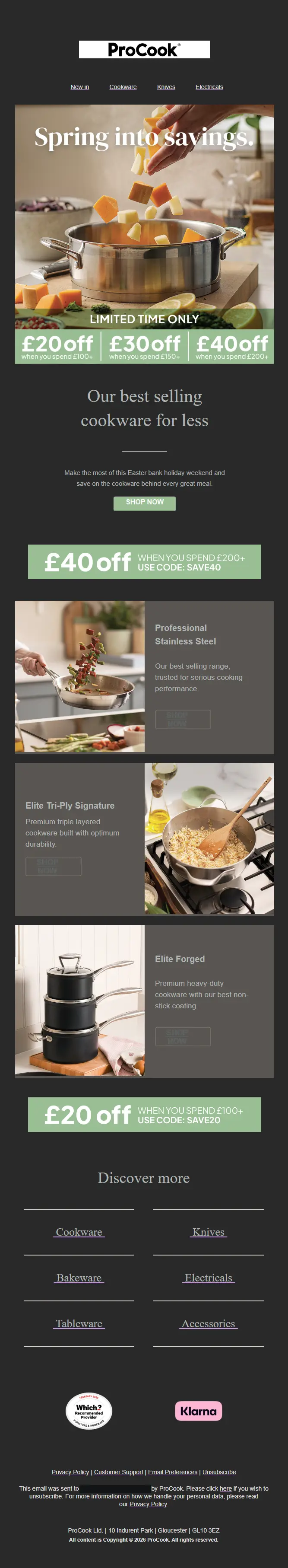
The CTA in this Manchester City email has inverted making the text blend into the background colour. As a result, it now fails accessibility as its contrast ratio is only 3.27:1. In light mode, the contrast ratio is 10:13:1. The example from Endura ensures its CTAs stay accessible in both light and dark modes with a ratio of 10.31:1 and 6.40:1. ProCook uses an elegant grey-on-grey style in this email example. However, in dark mode, it becomes harder to read as the background and text colours swap around:


Images
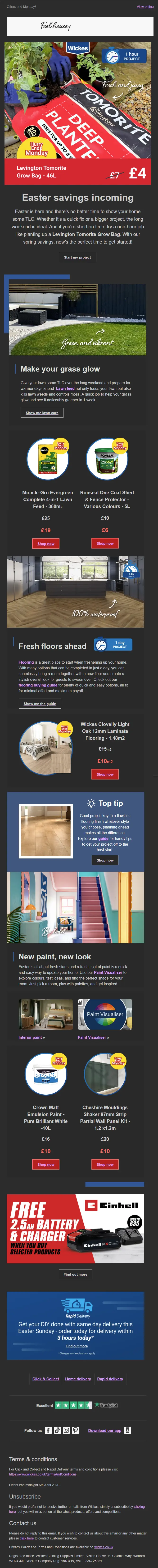
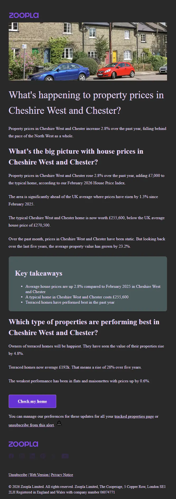
Wickes makes skilful use of transparent PNGs in their imagery in this email example. The Hurry Ends Monday callout works great here. If it were surrounded by a white background, it would lose its effect and make the dark mode version look clunky. Zoopla’s social icons virtually disappear in dark mode, resulting in their footer area looking out of place with the rest of the email.
To avoid their footer icons disappearing in dark mode, Tennis Point has placed them within white circles, making them stand out perfectly in dark mode, whilst in light mode, they simply display as black outline icons. Win-Win, or should that be Match Point?
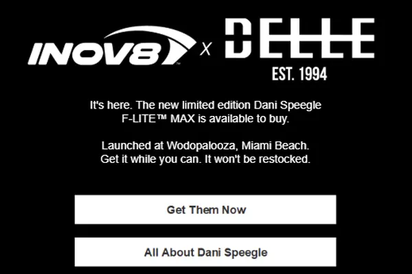
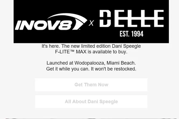
And finally, the difference between the dark mode and light mode for this Inov8 email creative is plain to see. It’s an ironic twist (especially with Outlook’s inversion) that dark background emails can be inverted to light backgrounds for dark mode users:
What you can’t control when coming up against dark mode
Some clients will override your design no matter what you do. Not every fix works everywhere. You cannot aim for pixel perfection. Instead, you need to aim for ‘nothing looks broken’.
Testing is the only reliable answer
There’s no shortcut here. If you’re not testing your emails in dark mode, you’re guessing.
At minimum, check:
- Apple Mail
- Gmail (iOS and Android)
- Yahoo
- Outlook variants
Tools like Litmus or Email on Acid make this easier, but the principle is the same. Test what you send.
It’s also important to find out what the most popular email clients your database uses are.
If you find that a significant percentage open using Outlook, then you’ll need to take extra care of your colour palette and design your emails more defensively. However, if they are all opening on Apple Mail, then you have far more freedom.
Recap
- Avoid pure white backgrounds
#ffffff - Don’t rely on transparent logos if they use dark colours
- Add backgrounds behind key elements
- Avoid using thin fonts for dark mode users
- Test images in both modes and adapt backgrounds if they are not readable
- Use
prefers-color-schemewhere supported - Assume some clients will override everything
Dark mode exists for a reason
It’s not there to make your emails look cooler. It exists because it makes content easier to read for many people, and in some cases, it’s essential.
For many, it reduces eye strain, improves readability, and makes content easier to engage with for longer periods.
That makes it more than a design challenge. It’s also a responsibility. If your email breaks in dark mode, it becomes both a visual issue and a usability issue.
We’ve been invited into your user’s inbox. We’re guests.
So, it’s on us to make sure what we send works properly when it gets there.
