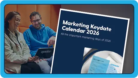
1.
Grab attention with hard-hitting headlines
Roughly half of the people who visit your landing page will bounce. Clearly that’s not ideal, so it’s essential to grab their attention and engage with them in the shortest amount of time possible. A simple way of doing this is to directly tell your visitors the benefits you can bring to them, and exactly what’s in it for them. All within seconds of them landing on your page. Your headline is the first thing that they will read, so it’s the perfect way to achieve this. Ensure that it’s clear, concise, and quickly communicates the benefits of them landing on your page so that they won’t be able to resist reading (or clicking) on.
2.
Inspire with your imagery
Of course, every landing page needs an image. But not just any image. Make sure that the imagery you choose reflects your audience and the goal of the landing page. Aim to convey a feeling and emotion to your audience. Suggest to them how they could feel after converting on your landing page. One particularly successful tactic to achieving this is by using photography of people to reflect positive emotions right back at the reader. We also would advise testing your various options for images, as something as simple as colour can have a big impact on results.
3.
Clear copy that engages your audience
You’ve crafted that hard-hitting headline and designed the perfect imagery. Now don’t let your landing page down with lazy copy. Cut the waffle, the jargon, and the fluff. Your copy needs to be clear and concise, helping your audience engage and understand the message you are conveying in the shortest time possible. And don’t forget to make it personal to them. Speak to them directly; incorporating their wants, needs, and challenges. All in a tone of voice that is familiar to them.
4.
Be bold with your CTA
Your CTA (call to action) is arguably the most important consideration of your landing page. This is the end point that will get you that all-important conversion. To ensure that it’s not ignored or skimmed over, make sure your CTA stands out. You could achieve this through bold or contrasting colours, or a prominent position on the page. Don’t forget to make the most of your CTA copy too. Make it crystal clear what you want the visitor to do, whether that be “Sign up”, “Buy now”, or “Download”. Keep it clear, bold, and simple.