Dark Mode definitely made it to the world of email experience. After a few years of experimenting, more and more software companies are darkening their display and email is happily hopping on that bandwagon. In this article, we analyze the effect Dark Mode has on your emails and how to cope with it.
What is Dark Mode?
Dark Mode is an accessibility setting on devices or in applications that turns the standard bright design into a dark, often more legible, color palette. Basically, Dark Mode switches black and white, reduces blue light and lowers the contrast of an interface.
Dark Mode has been around for a number of years, but email providers are quite late to the party. Outlook’s Dark Mode, for example, was introduced in 2019.
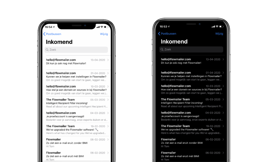
Pros & Cons of Dark Mode
To be frank: getting all your current emails Dark Mode proof takes a lot of time. To determine whether it makes sense for your emails to be optimized for Dark Mode, we’ll list the pros and cons of using dark mode below. Since there’s no real way to know how many of your recipients use Dark Mode (yet), use this list to decide if your audience is likely to darken their interfaces.
Main advantages of Dark Mode (for users)
- Dark Mode saves energy on a number of devices with OLED display (Apple’s iPhone XS, XS Max and X, plus a number of Samsung Galaxy and Google Pixel phones and a number of laptops).
- The contrast in Dark Mode is for some people more pleasant than the normal black-on-white: especially for visually impaired people and people who are sensitive to light (photophobia).
Main disadvantages to Dark Mode
- Dark Mode is believed have a negative impact on the performance of the user (especially in work situations an important indicator).
- The display in Dark Mode makes different elements of an email not easily distinguishable from the background.
What does Dark Mode do exactly?
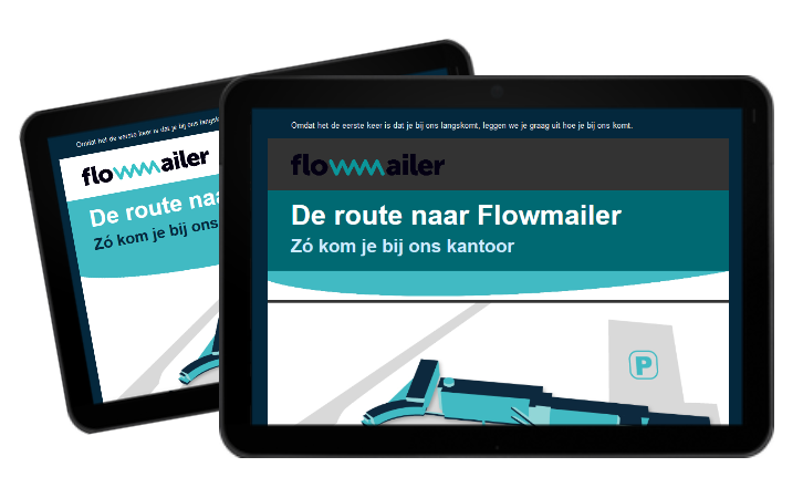
As mentioned earlier, Dark Mode has effect on the colors of the interface. By reducing blue tones in buttons, background colors and similar HEX values, Dark Mode color inversion results in a dull button or color in your email. In the example below we see the effect of Dark Mode on a white (#ffffff) header bar, a black (#000000) subtitle and a cyan (#41bac3) colored title block. The dark colors are brightened, and vice versa.
Support of Dark Mode emails worldwide
The way an email is displayed in an inbox depends on many factors, one of them is the displaying party. The exact effect of the dark mode depends on both web-based and app-based clients, or an app-based clients, Gmail or iCloud inbox, Dark Mode rendering differs per inbox.
Parties that support Dark Mode
Mobile
- iPhone & iPad Mail
- Gmail App (both Android & iOS)
- Outlook App (both Android & iOS)
Desktop
- Apple Mail
- Outlook 2019 (Mac OS & Windows)
Web
- Outlook.com
- Hey.com
Virtually all receiving parties automatically switch between white and black, depending on Dark or Light Mode. In Dark Mode the background is as dark as possible and contrasts with white letters, while in Light Mode it is ‘normal’ the other way around.
However, some parties do have a dark User Interface (UI), but do not have a black and white inversion for the emails themselves, like the example of the Gmail webmail on the right, AOL and Yahoo!-mail. Normally, for most parties, enabling Dark Mode for the application or the whole device just means that the contrast of the email will be changed as well.
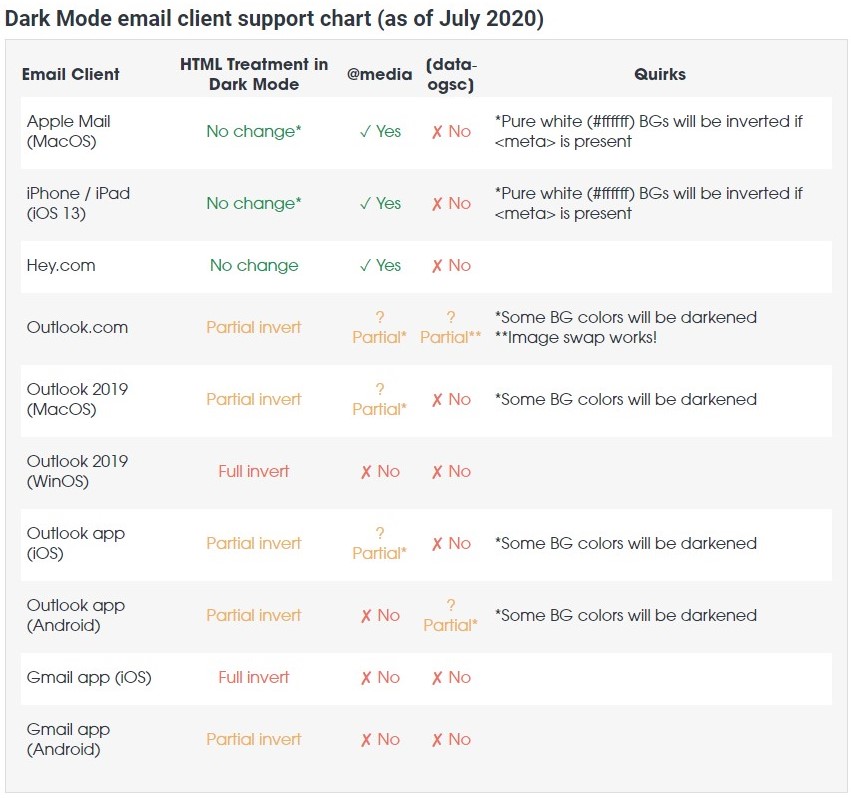
The table below shows how supporting email clients treat Dark Mode (Litmus, 2020)
Dealing with Dark Mode as an Email Sender
As an email sender, Dark Mode can be quite challenging, with three possible outcomes:
- You either leave it for what it is
- You try (& succeed) to crack the dark mode code with CSS
- You adapt your content to Dark Mode users
There is, however, no straight-forward solution to CSS ‘hacking’ Dark Mode. Only Apple Mail and versions of Outlook support this. However, what you can take into account as an email sender, are some tips that will help you optimize your emails for Dark Mode, without affecting your standard emails.
#1 Align your content
By giving the content in your emails a little more space on the side, you create a more readable email in all cases. For smaller screens it makes a difference that text is not glued to the side of the screen, but in some Dark Moded inboxes the text is more readable. This is because in normal mode black text has a lot of white space on the side, but a large part of this is removed in dark mode. As a result, the black text is really close to the dark background. With a little extra breathing space you can avoid that problem.
#2 Use as many .png format images as possible
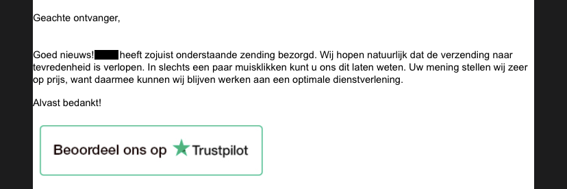
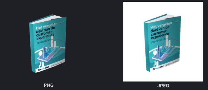
By replacing as many images as possible in your email with a .png file, you also increase the readability of your email. It is crazy, when you open an email and you see a completely dark email with white areas here and there. With .png images (the ones without background) you don’t have that problem. Moreover, png is very suitable for small images, such as a logo, text image or a thumbnail of a white paper (see example).
#3 Subtle lines around dark images
Another tip to make sure your email remains legible for your recipient is to add thin lines to dark images (often text). Although this is not your designer’s favorite tip, thin lines work well for your recipient. It will make it easier for the recipient to distinguish between the dark image and the dark background.

#4 Advanced: Switching between light and dark mode in the email
The fourth way to get your emails Dark Mode-proof is a bit more complicated. You can build a toggle in the email itself (on/off button) for different modes. This way you can create your own Dark Mode email.
The main advantage of this is that you have complete control over how an email is displayed in Dark Mode, because the recipient has the possibility to switch to your Dark Mode design. Contrary to the earlier mentioned design tips, this gives much more design freedom.
The disadvantage of this way of working, is that it is not yet completely known how to do it. There is a similar solution for the in-mail modification of content for e.g. visually impaired people (called Accessibility Switcher™), but not much has been experimented with it yet for Dark Mode, let alone for transactional emails. Therefore, this way of working requires more knowledge and skill.
In any case, working with these tips will always subject to testing.
Testing your dark emails
When you start optimizing your emails for Dark Mode, you want to make sure that your changes have the desired effect on Dark Mode and do not affect the normal version. That’s why it is important to keep testing. You can do this in two ways; either by creating a number of email addresses for yourself on which you test. Based on this article you can determine which email clients are relevant for you.
Another way to test your emails for Dark Mode compatibility is to send them to an email test tool, like ProofJump, which analyzes them for all known email clients. This way you have an overview of all variants that can be made of your email. The disadvantage is that not all test tools have enough functionality to test for Dark Mode.


