
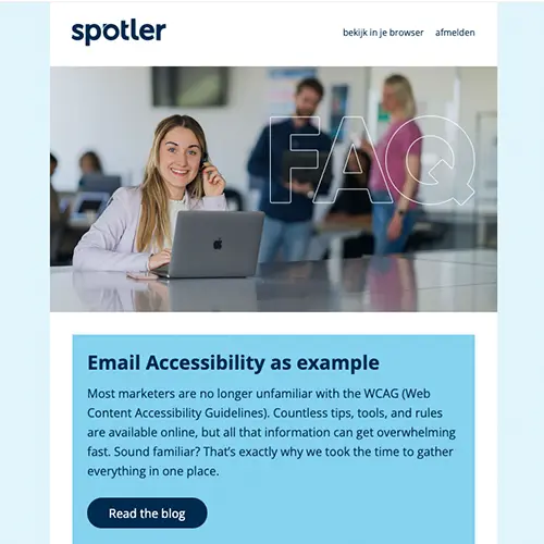
Most marketers are no longer unfamiliar with the WCAG (Web Content Accessibility Guidelines). Countless tips, tools, and rules are available online, but all that information can get overwhelming fast. Sound familiar? That’s exactly why we took the time to gather everything in one place.
In this blog, you’ll learn what email accessibility means, why it matters, and how to start making your emails more accessible today.
What is email accessibility?
Email accessibility means that everyone can read, navigate, and interact with your email regardless of any limitations or assistive technologies they may use. And that matters, because in Europe, around 1 in 4 people live with a disability.
This could be visual (like colour blindness or low vision), motor or cognitive. If 25% of your audience might struggle to read your email, accessibility is no longer optional; it’s essential. This includes the text, your colour use, fonts, images, and overall layout.
Why is it important?
If your emails aren’t accessible, you could miss out on a large part of your audience. Think of colour-blind readers who can’t distinguish certain hues, or people with epilepsy who are sensitive to flashing images.
Making your emails accessible ensures your message reaches everyone, without leaving anyone out. It shows what your brand stands for: empathy, inclusivity, and customer focus. Even if accessibility is something you’re exploring due to regulations, at its core, it’s simply the right thing to do.

What are the best practices?
Accessibility touches many parts of your design. Here’s a quick list of best practices:
- Consider visual aspects of accessibility in your design
- Use colour smartly
- Balance text and images
- Use larger font sizes
- Give your copy space
- Avoid justified (fully aligned) copy
- Choose a readable typeface
- Use semantic elements
- Improve overall readability
- Make links clearly clickable
- Avoid vague link text like “click here”
- Use ALT attributes correctly
Colour contrast in email
Good readability starts with a strong colour contrast. Text must be distinguishable from the background, especially for users with visual impairments.
WCAG guidelines state that contrast should be at least 4.5:1 for regular text and 3:1 for large text (18px or more). This ensures your message is visible to everyone. Not sure if your design meets the standards? Try our contrast checker tool.
A practical example: The three images below are tested with our brand colours. The left (white on light blue) is quite difficult to differentiate: 2.52:1. In the image on the right, the contrast between text and background is higher, and the text is easier to read: 5.8:1. That makes a world of difference. Of course, having a darker background creates better contrast, like the image on the right: 14.6:1.


Text and readability
Colour alone isn’t enough. Clear, well-structured text is key for readers and screen readers.
Make sure your copy is easy to understand. Highlight key points with clear headings, short paragraphs, and bullet points.
Tip: Avoid long blocks of text. Use headings like “What you need to know” or “How it helps you” to make it easier for everyone to follow.
Font size and type
WCAG recommends a minimum of 16px for regular body text. Use a clean, sans-serif font without decorative elements. Avoid italics or overly styled fonts for long texts — they can be hard to read, especially for users with visual impairments or dyslexia.
Images and ALT text
Images can make your email more visually appealing, but they need context for users who rely on screen readers. That’s where ALT text comes in: a short description explaining the content or purpose of an image.
There are four types of images:
- Text-based: Communicate a message or CTA
- Functional: Clickable elements like buttons or icons
- Informative: Add information not covered in the text
- Decorative: Purely visual, with no added meaning
Tip: Avoid embedding important text inside images; it’s not accessible.
For functional and informative images, ALT text is a must. For decorative images, use alt=”” in the HTML code.
Example: If you show a product photo and the image can’t be loaded, a clear ALT text ensures the reader still understands what’s being shown:
Links and buttons
Links in your email should be clear, clickable, and easy to understand. That means:
- Use descriptive link text
Avoid vague phrases like “click here.” Say what the link leads to: “Download the whitepaper” or “Sign up for the webinar.“ - Make links visually distinct
Underline them and use a different colour; colour alone isn’t enough, especially for colour-blind users. - Ensure good contrast
The link text must contrast strongly with both the background and surrounding text. Aim for a contrast ratio of at least 4.5:1. - Make clickable areas big enough
Links and buttons should be easy to tap, even on mobile. Give them enough padding and white space.
These tips help make your email more user-friendly and more inclusive. Win-win.
Test for accessibility
Once you’ve optimised your email, test it! Use WAVE, Axe, or Spotler’s testing tools to check accessibility. And don’t forget to test with a screen reader to ensure everything reads logically and smoothly.
In summary
Accessibility isn’t just about design; it’s about inclusion. Following WCAG guidelines makes your email campaigns accessible to a broader audience.
Every detail matters, from colour contrast and font size to ALT text and link clarity. You’re not just improving your UX; you’re showing you care.
So what are you waiting for? Start making your emails more accessible today and ensure your message truly reaches everyone.
Good luck hitting send!
